Table Talk and the Birth of Modern Magazine Cartooning An Incidental History of the Early Years of Punch Magazine and of Drawing for the Block
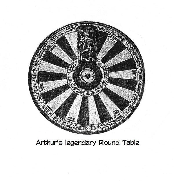
OF THE THREE FABLED ROUND TABLES on the cultural landscape, one is a purely poetic fiction, a make-believe table. The other two are associated with cartooning and are therefore completely real. Only one of the latter is definitely still extant, but so, oddly enough, is the fictional table. This
fabricated piece of furniture hangs high on a wall in what remains of a Norman
castle in Winchester, England. Just the table top; the legs, all twelve of
them, have long since disappeared. Reputed to be the Round Table of King
Arthur’s Camelot, this antique is gayly painted in twenty-four pie-shaped
segments, each one labeled with the name of one of Arthur’s knights. The table
is round, according to legend, so that none of the chairs around it will be at
the “head” of the table and therefore no knight can claim precedence over the
others (a foolish albeit chivalrous sophistry since wherever Arthur sat was the
“head” of the table). It was Thomas Malory who identified Winchester as the site of Arthur’s court in his Morte d’Arthur, published in 1485. He may have been prompted to this supposition by Winchester’s historic function as the seat of Alfred the Great’s 9th century hegemony. Whatever Malory’s motive, since King Arthur is more legendary than real (even though an actual Arthur may have inspired the medieval minstrelsy in which the monarch first emerges), his Round Table is assuredly a fiction. The one on the wall was probably made in the 13th or 14th century, long after the supposed 5th - 6th century reign of the inspirational Arthur. It may have been constructed for Edward III, who, at one time (1344), formed the idea of reviving Arthurian knighthood; he gave it up, however, and founded the Order of the Garter instead. (Probably more fun.) Or maybe it was built to celebrate the second marriage of Edward I (1299), who was something of an Arthurian nut. As far as I know, no cartoonist ever sat at it. No
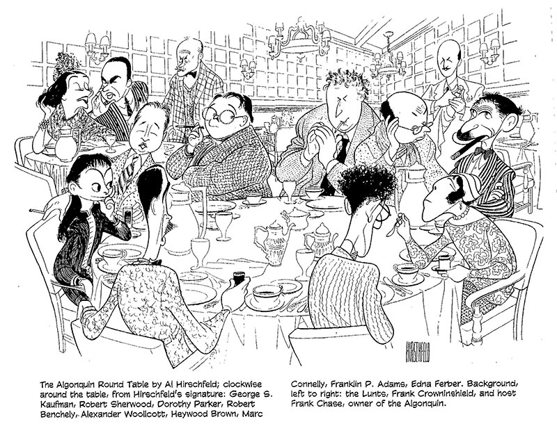
cartoonists sat at the Round Table in the dining room at the Algonquin Hotel in
New York either. But among the literary and journalistic wits who lunched there
regularly in the 1920s, making themselves notorious if not famous by quoting
each other in their magazines and newspaper columns, was Harold Ross, who, as
founder of The New Yorker, would have a profound influence upon the development
of the modern single-panel gag cartoon. It was Ross who sought cartoons with
single-speaker captions the sense of which depended upon the reader’s
comprehending the implications of the picture as well as the meaning of the
words—what Ross termed “idea drawings.” The Algonquin’s tiny dining room still has a round table conspicuously in the middle towards the back, but I doubt that this artifact is the actual table around which Dorothy Parker, Robert Benchley, Franklin P. Adams (FPA), Alexander Woollcott, George S. Kaufman, and the rest pulled up chairs nearly every weekday for lunch and gossip. Our
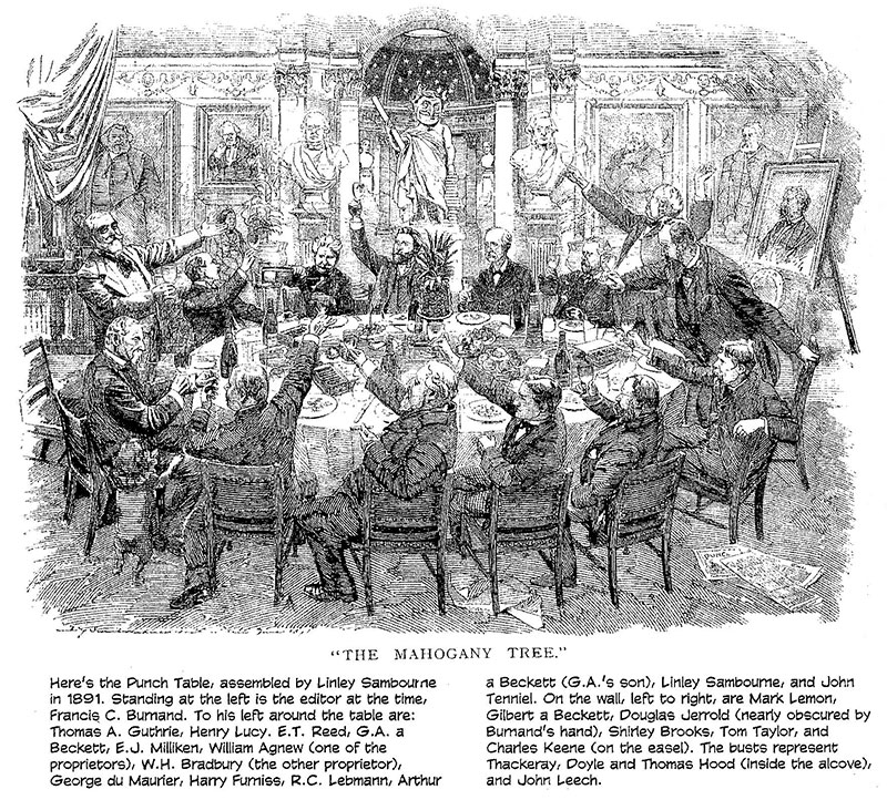
third round table, on the other hand, undoubtedly still exists—in a storeroom, probably,
in Harrods department story in London. Oblong rather than, strictly speaking,
round, this is the famed Punch Table. And around this storied board sat such
celebrated cartoonists as John Leech, John Tenniel, William Makepeace
Thackeray, George du Maurier, Linley Sambourne, Phil May, Frank Reynolds, Harry
Furniss, Ernest Shepard, Norman Mansbridge, Bernard Hollowood, Kenneth Bird,
L.G. Illingworth, Michael ffolkes, William Hewison, and Ronald Searle, to name
a few of the names most likely to be recognized on this side of the Atlantic.
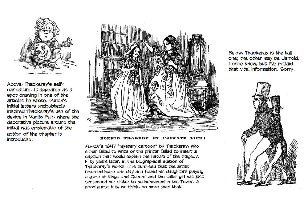
We know these cartoonists sat at this table because they carved their initials on the tabletop. When, exactly, the tradition of defacing office furniture began we can’t say with precision. Nor can we say when the table first put in its appearance. But it probably entered the history of the English language’s renowned humor magazine early in 1843, when Punch, which gave “cartoon” its modern meaning, was about 18-20 months old. The only Americans ever invited to inscribe their initials on the table were Mark Twain, James Thurber and Arnold Roth. Twain declined the honor, saying he would be quite satisfied to share the last two initials in Thackeray’s elegantly executed monogram. (“Everyone assumed that he was simply too drunk to handle a penknife,” Roth told me with a chuckle.) Sadly, after 161 years of making Olde Englande merrie, Punch closed shop in 2002 at the end of May. It was the second time that Britain’s revered institution of satire and humor had expired. The weekly magazine shut down in 1992 when its circulation, once as high as 175,000, dropped to about 34,000. It was reactivated by Mohamed al-Fayed, millionaire owner of Harrods, another English institution, in 1996 to much enthusiastic fanfare, but the enthusiasm did not, apparently, translate into newsstand sales, which were reportedly less than 22,000. It was kept afloat through the last six years by colossal injections of Fayed cash, but the entrepreneur finally could no longer justify sustaining the losing business. “I was immensely proud when I was able to revive the magazine after four years of absence,” Fayed said, but it no longer made “commercial sense” to keep it going. The title will survive at its website, where over 500,000 cartoons are electronically archived. There, we can still inspect the graphic hilarities of Richard Doyle, H.M. Bateman, David Langon, Rowland Emett, and that string of single sobriquet geniuses, Sprod, Pont, Siggs, Thelwell and the sublime Fougasse (aka, Kenneth Bird). We know how and when Punch died, but we know with considerably less exactitude how it was conceived. The first issue of Punch, the London Charivari is dated July 17, 1841. Various documents establish the magazine (called a “paper” in the argot of 19th century England) as a property owned by five people: one-third, by the printer, Joseph Last; one-third by the engraver Ebenezer Landells; and the final third shared by co-editors, Mark Lemon, Henry Mayhew, and Stirling Coyne. Of the lot, only Lemon was still engaged in the magazine by 1847, when it had solidly established itself. But even before that, the three-penny weekly had become what one historian called “the most talked about and enjoyed periodical of its time—quoted in The Times, the House of Commons, the law courts, and in the everyday conversation and letters of persons of importance on both sides of the Atlantic,” citing Thomas Carlyle, Robert and Elizabeth Browning, and the Queen and her consort in Britain; Ralph W. Emerson, William W. Longfellow, and Emily Dickenson in the U.S. Due to Punch’s subsequent fame, the descendants of several personages associated with its early history have claimed the distinction of conceiving the idea of the magazine for their forbearers. Gilbert Abbott a Beckett, a journalist and life-long contributor to Punch, was the inspiration according to his grandson, whose father, too, had written for Punch: Punch had its origins in Beckett’s 1831 creation, Figaro in London. Not so, say the relatives of Douglas Jerrold, a brilliant journalist and playwright whose achievements are, today, forgotten in the shadow of the attainments of his close friend, Charles Dickens. A
small man with a comparatively large head, Jerrold was caustic and
bad-tempered, specializing, not surprisingly, in scathing insult. His friends
called him “Little Wasp.” When tipsy, he grew savagely belligerent; sober, he
was warm, funny, tender and thoughtful. IN YET ANOTHER VERSION of the magazine’s origins, we find a trio of British humorists in Paris in 1835—Mayhew, Jerrold, and Thackeray (in town to study art)—who were mightily impressed by a Parisian daily paper called La Charivari, the chief feature of which was a full-page cartoon that ridiculed social foibles and the peccadilloes and politics of the city’s notables. La Charivari, launched in 1832, was the third magazine endeavor of Charles Philipon, who, in the opinion of many who ponder these matters, deserves credit as the founder of modern journalistic caricature. Philipon’s first attempt in 1829 was La Silhouette, a variety periodical offering a lithograph and satiric text. His next publication was a weekly, La Caricature, which he started in 1830, dropping La Silhouette to do so. La Caricature was a slightly more ambitious undertaking, publishing two full-page lithographs, one in color (sometimes, a single two-page picture), and a page of text. The time was propitious for a relentless gadfly caricaturist like Philipon, and a picture periodical was a stinging goad in his hand. The French had just forced their autocratic king, Charles X, into exile, and in the constitutional monarchy that was subsequently inaugurated, they installed a distant relative of Charles, Louis-Philippe. The government that resulted was an oligarchy of landowners who hoped to cash in; liberals, seeking to create a more representative democracy, protested, ushering in a chaotic time of social and political unrest. Philipon eagerly joined in the fray, snapping at the heels of a discomfited ruling class with pictures that he knew were more influential than words. His
pictures plunged him into political hot water almost at once. His print shop
was raided and copies of his paper seized almost weekly. He was continually
hauled into court and fined, and sometimes imprisoned. His most famous
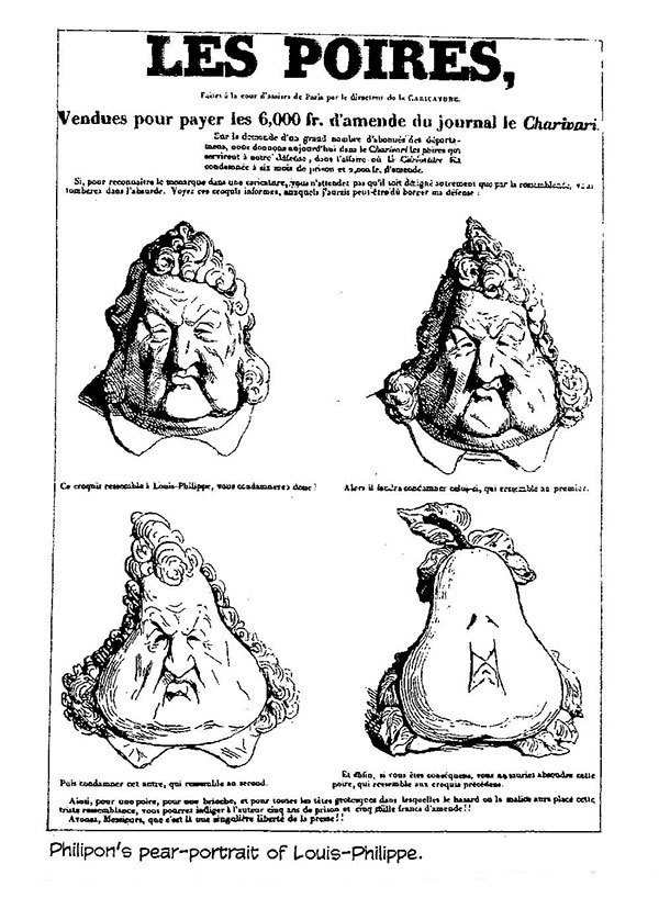
caricatural creation was the Pear. Noticing that Louis-Philippe’s jowly physiognomy was broader at the bottom than at the top, Philipon drew a series of pictures in which a likeness of the king transformed itself into that of a pear, punning visually upon the French poire, which means “imbecile” or “simpleton” as well as “pear.” Philipon’s conception was imitated throughout the Parisian reform press, in which the Pear now stood for the king: every time Louis-Philippe appeared, he looked like a pear. Philipon was a hero to British journalists. Forced to suspend publication of La Caricature in 1835, he continued his assaults on the establishment in La Charivari (“the noisy hubbub”), which had literary pretensions and a range of interests that extended beyond politics to fashion and society. But its central lithograph was still its most powerful ingredient: in a society in which many could not read, pictures spoke volumes. An admiring Mayhew and his cohorts talked about starting a British version of La Charivari, and Thackeray and Jerrold continued discussions in London, involving Orrin Smith’s circle of artists and engravers, but the idea collapsed when Thackeray frightened everyone away by suggesting that the partners would be responsible for one another’s private debts, Thackeray’s reputation for financial improvidence being well known. Last’s family claims the idea originated with him; Mayhew’s relatives say Last got the idea from Mayhew. And so on into the night. Whatever the case, R.G.G. Price in his History of Punch undoubtedly has the right idea when he says: “Detail is misleading. Comic papers were in the air, and some of those published in the previous decade had the word ‘Punch’ somewhere in the title. The staffs of these short-lived periodicals overlapped. Merry fellows met other merry fellows in taverns and talked plans. Sometimes new publications began with a suggestion from a publisher, more often with a group of writers and artists who got together and turned out something that, like amateur dramatics, was half for the fun of it and half with the hope of making a profit. Scribbled on greasy tabletops in chop-houses, on bar-counters, in college rooms, in the wings of theaters, at smoky sing-songs in dubious cellars, in sponging-houses and debtors’ prisons, the comic journals showed the embittered raffishness of the milieu from which they came.” Price points out that the journalistic milieu of the day “was divided sharply into solid, respectable newspapers or magazines, like the Morning Post and the Edinburgh Review, and a proliferating underworld of scurrilous, near-pornographic, hysterically abusive papers that fought savagely in Party warfare or private feuds. Opponents were attacked by lies, rhetoric and sneers, and the sneers were as far as the average swashbuckling journalist got towards laughter. ... The press as a whole had a vigor and much of it was written by clever men, who could not earn a living elsewhere but showed some lingering evidences of education. There was room for a paper that was warm-hearted rather than hot-tempered, happy instead of venomous, and clean enough for the Family, a paper that took the Radical line from generosity and not from spite.” This, it turned out, would be the reason for the eventual success of Punch over its numerous rivals: it sought gentility, and in Victorian England (as in the U.S. at the time), middle-class aspirations were usually expressed in genteel yearnings. Punch championed the down-trodden and the oppressed and assaulted privilege and pomposity, but “it eschewed the ribaldry of the tavern and the pawnshop” (as Price put it; and I’ve offhandedly borrowed others of his facile phrases hereabouts). Mr. Punch, a doughty challenger of outworn custom and abuse of power, bristled with political jests amid his reports on Parliamentary doings, but he was not as vicious as his scandal-mongering competitors, and he attended also to everyday life with a sympathetic albeit jocular air. Like The New Yorker of the next century, Punch conveyed a feeling of being in the center of a swirl of exciting and amusing cultural activity. Altogether, it was the sort of humor magazine that appealed directly to the British middle class as it was growing in number, gaining in political and social clout, and aspiring for better things. For this class, “respectability” and taste—a decorous restraint in all things—were replacing the gaudy excesses of Regency London. Launched on the rising tide of this social evolution, Punch was lifted to prosperity within a very few years. But the Punch Table, that merry oblong, had its origins in the tavern life of London.
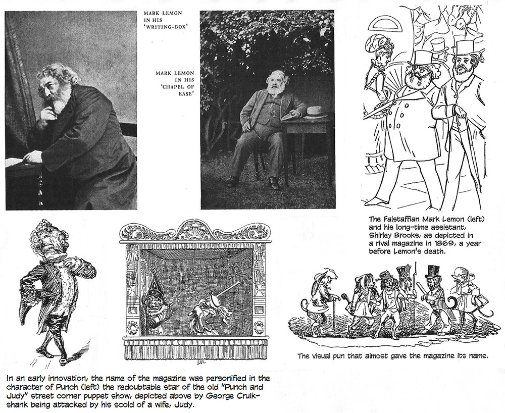
THE MAN WHO MADE A SUCCESS of the enterprise, Mark Lemon—like The New Yorker’s Harold Ross—wrote very little for the magazine, but he knew, dimly—as did Ross—what he was after. In the years before Punch, he had served his comedic apprenticeship hacking out light verse and sporting sketches, plays, farces, melodramas, and burlettas in great profusion. But in 1840, he was a publican, running his mother’s inn, Shakespeare’s Head, in London. Lemon set himself to give the tavern a literary patina. He announced a weekly magazine, Pen and Palette, and solicited contributions that were submitted pseudonymously on foolscap dropped into a box on the bar. Once a week, these effusions would be read aloud and discussed by Lemon and the habitues of the inn. One of the denizens was Mayhew, and when Mayhew caught the publishing enthusiasm from Last and Landells, he approached Lemon for suggestions in staffing the magazine. Mayhew and his coterie met with Lemon several times at various watering holes around London. Legend has it that the name Punch came about as a result of a spontaneous quip, uttered during the last of these editorial conferences. They had decided to call the magazine The Funny Dog because they could waggishly explain, on every issue’s masthead, that “funny dogs have comic tails (tales).” Then just as Lemon was starting to pen the magazine’s prospectus according to the dictations of his conferees around the table, someone suggested that “Punch” would be a better name because “you can’t have good punch without lemon.” This punning suggestion was roundly applauded, and Lemon, who had actually written “The Funny—” at the top of the paper, crossed it out and wrote “Punch.” (Yes, this historic document still exists in the vaults of the magazine.) Lemon, however, never confirmed the authenticity of this tradition: in later years, asked why the magazine was called Punch, he replied, “Because the title was short and sweet.” The
earlier idea for the magazine’s name was preserved in the printed prospectus,
which carried, as its concluding illustration, a woodcut of several dogs in
various costumes, captioned “Funny Dogs With Comic Tales.” Having been christened in a saloon by a band of merry men, Punch brought forth its weekly issues ever after under circumstances as similar as could be arranged. The owners and editors met weekly for dinner at various London pubs to discuss the contents of the next issue amid the conversational cacophony of a circle of contributors and their friends and assorted hangers-on. The main satirical thrust of each issue was the “Big Cut,” as it was called (employing a printing and engraving term), a full-page cartoon (which, initially, like its Parisian model, had nothing printed on the reverse side), and the weekly gatherings were convened ostensibly to pick the subject of the cartoon and determine its composition. But the table talk soon expanded to include all sorts of suggestions about the topics to be treated in the forthcoming issue. And it was in his management of this loquacious milieu, of a small group of talented and sometimes eccentric men vociferously engaged in argument and conviviality, that Mark Lemon demonstrated his mettle.
BY THE END OF
1842, all the original owners of Punch had been bought out by the
partners of a London printing firm, William Bradbury and F.M. “Pater” Evans,
and the weekly dinners, now unalterably on Wednesday nights, were removed from
the clamor of public houses to relative quiet of a private room set aside for
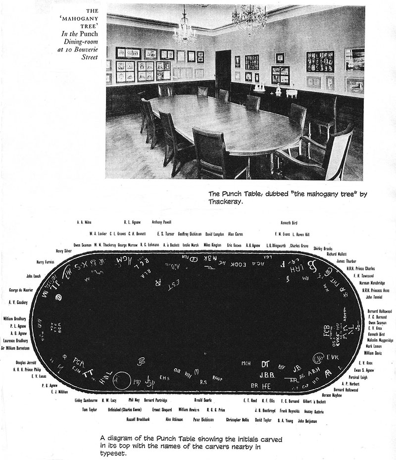
the purpose at the printer’s office. Soon thereafter, the table itself
appeared: nothing fancy, “a rather primitive piece of joinery” according to
M.H. Spielmann in The History of Punch—just a rectangular Victorian
deal-top table, rounded at the corners. To signify the permanence of the
magazine and the fellowship (“The Parliament of Wits and Conclave of
Humorists”), members of the company were invited to carve their initials in the
tabletop. Once his initials were engraved into the table, the newly installed
member was a Tabler for life. Not
all Punch staffers were automatically “members of the Table”; Tablers
were selected in part for their wit and volubility, for the fecundity of the
camaraderie they were likely to foster, as well as for the regularity of their
contributions and their talents. New members were added only to take the chairs
of recently deceased members, a practice that, as the century drew to a close,
tended to breed a fogeyness around the table that resulted in an increasingly
stodgy publication. But in the beginning and for the first dozen years or so,
the group was young and energetic and unafraid, displaying an eager willingness
that, later, the sacred traditions of the magazine as “institution” would tend
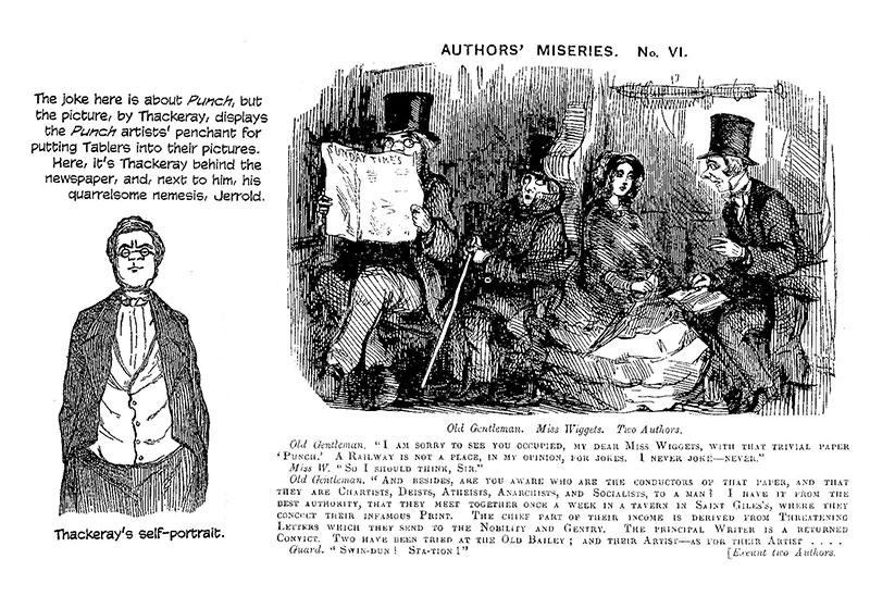
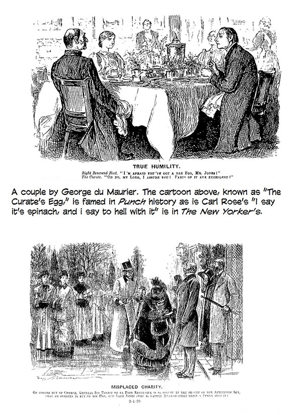
to stifle. Thackeray, an eminently clubbable man, was most at home at the Table. Six-feet-three and pink-cheeked, spectacles perched on a broken nose, he was subject to fits of depression when alone and hence treasured the goodly fellowship of the Wednesday dinners. Even after he became a successful novelist with the publication of Vanity Fair in 1847 and subsequently ceased contributing regularly to the magazine, he dined at the Table often, doting on and participating in the cheerful collegiality. A skilled cartoonist as well as a humorous writer, he drew for Punch and he would illustrate Vanity Fair with drawings that were often integral to the text in the manner of the best visual-verbal blending of cartooning. In many instances, the pictures functioned emblematically. The fool in cap and bells recurs as a visual motif throughout the book, and Becky Sharp appears as a mermaid, a female Napoleon, and, in a full-page etching, as Clytemnestra, a murderess, re-enforcing the intention Thackeray alluded to in words. Enterprising publishers who over the decades printed the novel without Thackeray’s illustrations damaged the book in a substantive way that they, thinking, doubtless, that illustrations were incompatible with serious literature, were blissfully ignorant of. Thackeray was a genial conversationalist and formidable advocate, bringing to the Table’s evening task an understanding of the visual medium and an ability to articulate that comprehension. And he exerted an influence at the Table that nudged Punch in the direction of middle class values: slowly, over several years, the magazine became less radically strident and more comfortably comedic, more an anodyne for the middle class than “a scourge of the rich and powerful” as one writer put it. According to another, “Jerrold’s frontal attacks on incompetence and privilege and the mockery of the powers-that-be became increasingly subdued, and the Thackerayan voice became more emphatic. It was a morally radical voice that observed shortcomings and aberrations everywhere and not simply among the elite. It played with tones and inflections, and it delighted more in mockery than in rant.” It was, in short, the sort of voice that would be welcomed into any well-regulated Victorian home. And it was, with enthusiasm.
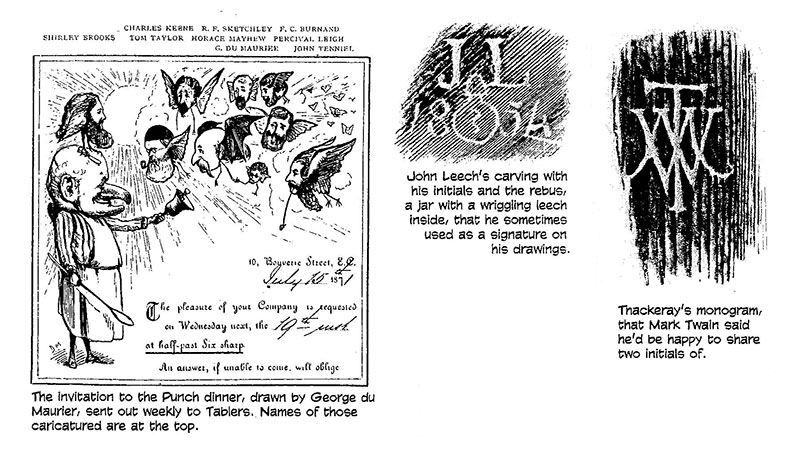
THE CIRCUMSTANCES surrounding the origin of the magazine left “a valuable legacy,” Price says: “In fact, though not in law, Punch remained a partnership between the leading contributors and their printers and publishers.” Since the beginning of the dinners at the printer’s, this relationship was symbolized by the seating arrangements: the editor sat at one end of the table and chaired the meeting; the senior proprietor sat at the other end as the chair’s “Vice.” Lemon, an accomplished and sometimes ruthless conniver as well as a humorist, secured for himself and his successors great editorial freedom. “The system,” Price said, “worked because it was set in a framework of friendship. [Proprietor] Evans was a close personal friend of the editor. They respected each other’s professional and convivial qualities.” The staff respected the expertise of the printer and owner, and he respected the talents of the staff. “The weekly meeting,” Price concluded, “with its wit and furious arguments and rather demonstrative friendliness, helped to produce a common tone without producing too narrow an orthodoxy. Evans said, ‘Sociality is the secret of the success of Punch.’” “The dinners,” according to Arthur Prager, chronicler of The Mahogony Tree: An Informal History of Punch, “were hilarious, devoted to gormandizing, hearty boozing, jokes, horseplay, gossip, obscene limericks, and, finally, to work. ... The menu,” he continued, “usually consisted (in those days) of five courses and champagne, provided by Bradbury and Evans.” Turtle soup, salmon cutlet, cold beef or a saddle of lamb, pineapple fritters, cheese, strawberries and cream, cherries, pineapple punch, champagne, sherry and claret made a typical evening’s repast. In the 1840s—and until the British adoption of afternoon tea postponed the dinner hour—the Table convened at six o’clock, promptly, with Lemon, a rotund woolly-bearded Falstaffian giant of a man, greeting his henchmen jovially as they took chairs around the table at the places designated by their initials. The dining was preceded—and accompanied and followed by—an amplitude of imbibing from a generous assortment of liquid emollients. “In the ensuing merriment,” writes Arthur Adrian, Lemon’s biographer, “authors and artists became a party of grown-up boys, roistering, buffooning, often bursting into song. Once, when dessert was about to be served, the hilarity rose to such a pitch that Evans (nicknamed ‘Pater’) bowled a large pineapple at Bradbury, who had asked for a slice of it. To everyone’s amazement, not a single wineglass was broken in transit. ... ‘Uncle Mark’ could always provoke laughter. Whether he gave one of his unforgettable impersonations of after-dinner speakers or told one of his earthy jokes, he could be counted on to relax tensions. ... [He was, according to the diary kept by one of the Tablers,] a glorious imitator, chatty and merry, and full of anecdotes.” On one occasion, Lemon told of the time that a parrot, integral to the production of his farce, Star of the Streets, died just before the curtain was to go up. One of the theater’s factotums dashed out to a nearby brothel where he knew another parrot resided and borrowed it. The bird then caused consternation on and off stage by squawking “Show us your cock” at embarrassingly inconvenient times during the production. At eight-thirty, cigars were lighted all around, and Lemon, a sheet of paper before him and a pen in his hand, looked over the assembly and posed the ritual question that transformed conviviality to cogitation: “What is it to be?” And as suggestions for the Big Cut came forth, he jotted them down. “His place [function] as editor,” the diarist recorded, “was always to avoid dictation, reserving merely the power of correction—[thereby benefitting from] a variety of minds unfettered by his own.” The discussion that ensued, aimed at creating the featured imagery of the issue, was a confabulation that yoked pictures to ideas and words to pictures, an act of cartooning in itself. Sometimes the Big Cut was determined at once; other times, an idea bounced back and forth from one side of the Table to the other, at every bounce, being slightly re-shaped, polished and modified, sometimes to the extent that the final conception bore little resemblance to the initial notion. On rare occasions, an idea refused to emerge, the comedic and satiric muses falling mute, wits dull and dried up. Shirley Brooks, Lemon’s faithful assistant who had joined the Table in 1851 and would succeed to the editor’s chair when Lemon died in 1870, was often inspired during such droughts. At the last desperate moment, he would blurt out an idea, perfectly serviceable, punctuating his suggestion by throwing his knife on the table and exclaiming with finality, “There’s your Cut!”—and then lean back in his chair, breathing hard. Stuck by the eccentricity of Brooks’ habitual gesture, another of the Tablers, prompted by his own inspiration on a similar occasion, picked up a whole handful of knives and forks and flung them down with a clatter, proffering his idea with “a Shirleyan sniff.” After the Big Cut was decided, the Table turned to the Second Cut, a second full-page picture, for which they also contrived the lengthy conversational exchange of the caption (or “cackle” as it was called). Although the dinner was a working session, the conversation strayed beyond business. Relaxed over an excellent banquet, the “exuberant spirits” of the Table members rejoiced in the opportunity to “exchange points of view and match wits, to consider contemporary social, political, and intellectual issues,” according to Adrian. These conversations, he said, “furnished many of the topics that were later fed into Punch to keep it alive to the spirit of the time. Adroitly steering the discussions, quickly detecting the touchy areas of personal friction, frequently indulging in boisterous antics and off-the-record jokes, Mark Lemon built up an esprit de corps hitherto unequaled” in the production of a magazine. Another great factor in Punch’s success was Lemon’s insistence upon paying regular contributors a weekly salary and demanding of them a specified quantity of material for each issue. Although some writers took advantage of this arrangement to crank out hackwork for Punch while selling their best efforts elsewhere, the system nurtured a cadre of contributors who could be coached and trained to produce a particular kind of product, “all pulling together,” as Lemon often said, invoking the memory of a witty exchange early in the history of the evening confabulations. On that occasion, the acid-tongued Jerrold was pestered by the attentions of a contributor whose work he felt inferior, and when that individual whined, “After all, you know, we row in the same boat,” Jerrold retorted: “True, but not with the same skulls [a pronunciation approximating ‘skills’ but referring, in the context of the metaphor, to ‘oars’].” Or so the legend has it. Jerrold had little use for one of Lemon’s co-editors, Stirling Coyne, who gained his position because he was a witty playwright but he contributed very little to the magazine. And when he was forced out because he stole an article from another magazine, Jerrold sniffed: “Stirling Coyne? I call him Filthy Lucre.” But because of the sting in his jibes, Prager says, Jerrold had “a great many orphaned barbs fathered on him, just as a century later numerous gratuitous insults never uttered by Dorothy Parker were credited to her for want of anyone else to blame.” As the weekly discussion batted an idea for the Big Cut back and forth across the Table like a shuttlecock, the cartoonist whose assignment it was to draw the cartoon pondered his options for composition. Sometimes he scribbled a rough drawing on a sheet of paper; sometimes, not.
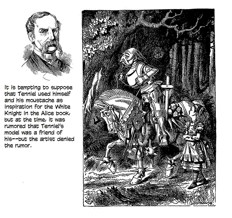
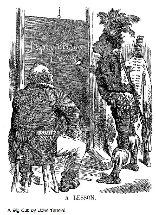
JOHN TENNIEL,
who joined Punch in December 1850, was a naturally taciturn man and
throughout the meal, sat silent and inscrutable behind his luxuriously drooping
walrus moustache. The “woodblock” referred to is a piece of exceptionally hard wood like pear or box, which, apart from copperplate, was the principal means of printing illustrations until photoengraving was perfected in the 1870s and 1880s. The woodcut method involved two professionals: the artist who drew the picture on the end grain of the block (which was polished and given a thin coat of chinese white to provide a suitable drawing surface), and the block-cutter, or “engraver,” who cut away the wood wherever the design was to be white, leaving only the lines of the drawing, now, in effect, “raised” slightly to receive the application of ink at the same time as adjacent columns of metal type. I’m no expert on woodblock production, but it would seem from all the evidence and testimony I’ve seen, that the artists worked in a variety of ways. Some made detailed drawings on the block; others produced more loosely rendered sketches. Some finished their pencil drawings by adding tonal variations with cross-hatching of varying detail and precision; others created a variety of tone with a wash applied directly to pencil drawings. Whatever the method, the engraver’s task was to produce the same visual effects with linear means alone. Thus, the gray tones of wash or of scribbled penciled shading had to be achieved in the final engraving by cross-hatching with lines of varying thickness and proximity to each other (lines close together made a darker tone than lines further apart). Tenniel’s celebrated drawings for Lewis Carroll’s Alice books were finished pencils on blocks, cross-hatched and shaded; the engraver simply traced Tenniel’s lines by cutting the wood away from them. Tenniel once described his routine for producing the Big Cut for Punch: “I get my subject on Wednesday night; I think it out carefully on Thursday, and make my rough sketch. On Friday morning I begin, and I stick to it all day, with my nose well down on the block. By means of tracing paper—on which I make such alterations of composition and action I may consider necessary—I transfer my design to the wood and draw on that. The first sketch I may, and often do, complete later on as a commission. ... Well, the block being finished, it is handed over to [the engraver Joseph] Swain’s boy at about 6:30 to 7 o’clock, who has been waiting for it for an hour or so, and at 7:30 it is put in hand for engraving. That is completed on the following night, and on Monday night I receive by post the copy of next Wednesday’s paper [the magazine].” The paper, although dated Saturday, appeared on the newsstands on Wednesday. During the early years, Punch artists were sent a slice of tree by cab, signaling the approach of the delivery deadline. Thackeray enjoyed a somewhat more relaxed situation. Swain lived near him and would usually drop in on his way to his works in order to pick up any blocks that were drawn and ready for cutting. Often, Thackeray would not make the drawing until Swain showed up, and the engraver, puffing on a post-breakfast cigar, would chat with the cartoonist while he worked. “Ah, Swain,” Thackeray exclaimed on one occasion, looking up from the block, “if it hadn’t been for Punch, I wonder where I should be!” With daily or weekly publications, speed was vital in the production of large illustrations like Punch’s Big Cut. For these, the block was made by bolting together several end cuts, and the picture was drawn on their adjoining polished surface, then the block was taken apart and each of its smaller components was given to a different engraver. Working simultaneously on segments of the same picture, several cutters could finish their work in time for the press run. When they finished, the parts of the block were bolted back together, the segments of the picture now reunited, and the master engraver refined the connections to render the joins nearly seamless. The skill required to make the joins invisible is all the more amazing when we remember the prevalence of complex, exhaustive cross-hatching in illustrations of this period.
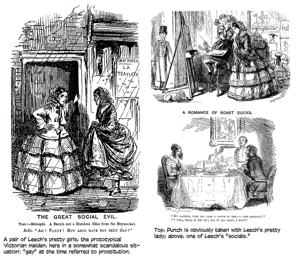
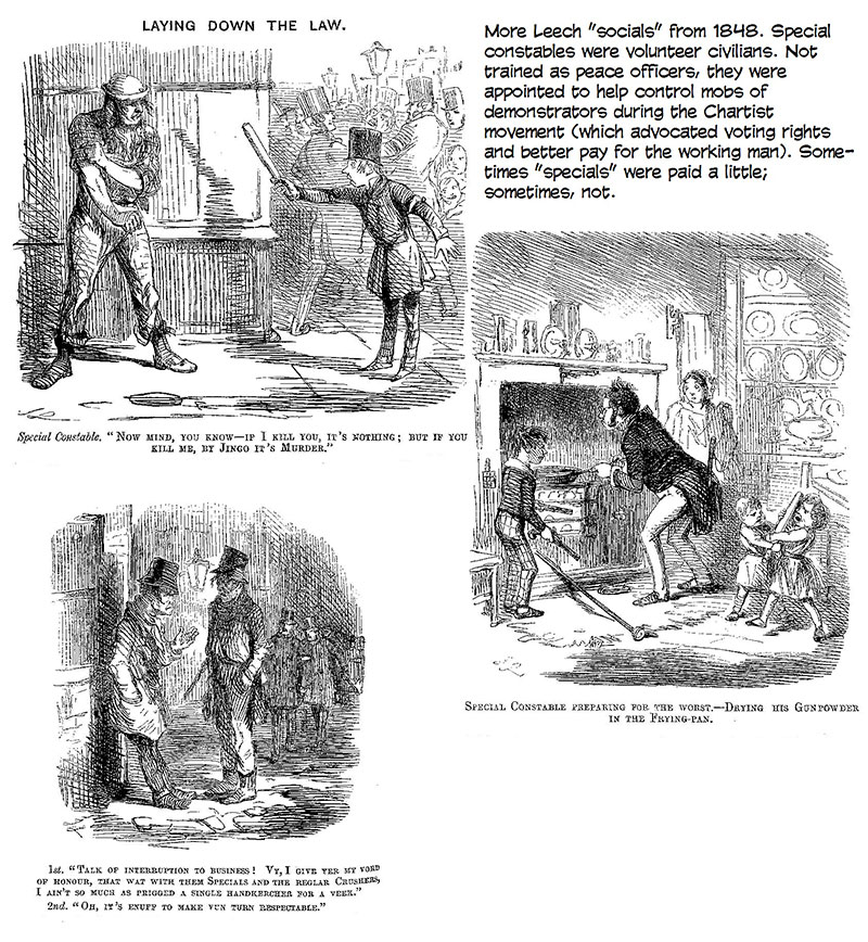
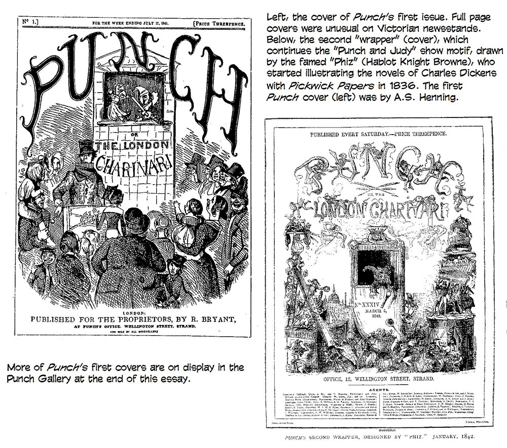
ARCHIBALD HENNING WAS THE CHIEF ARTIST for the first issues of Punch, but he left in less than a year, and his place was filled by the first of Punch’s superstars, John Leech, who had been aboard since his first published drawing, the Big Cut in the issue for August 7, 1841. (It was a memorable debut: Leech, unaccustomed to working on a block, was tardy in delivering the work, and the magazine came out a day late. Leech was given no more assignments for six months, by which time, he’d acquired some facility at the block.) Best known today, perhaps, as the first illustrator of Dickens’ Christmas Carol, Leech was a medical student when his father went bankrupt, and, forced to earn a living, the young man deployed his only marketable asset, a bent for drawing. In 1841, he followed a writer friend, another former medical student, to Punch. In his 23 years with the magazine, Leech drew more than 3,000 cartoons, but only 600 of them were Big Cuts. His preference was for “socials,” the smaller amusing pictures of domestic events, street adventures, and sporting divertissements. After Tenniel joined Punch, Leech happily left the political comment of the Big Cuts to him and turned to his favorite subjects—valets and servant girls, drunken cab drivers and officious railway conductors, arrogant swells and foolish maidens, and hunters astride elegant horses. In finding humor in everyday life and in picturing it for so many years and in such quantity (particularly as the cartoon evolved into captioned comedy), Leech may have done more than any of his colleagues to develop the cartoon medium. Leech was noted for his ability to portray pretty young women. “Small, curvaceous, with large innocent eyes, soft round chin, dimples, and hair in ringlets,” Prager says, “Leech’s girls were prototypes of the Victorian young woman as she is known today.” Leech’s model, it is reported, was his wife. He had fallen in love with her at first sight while walking a London street; he followed her home, found her name in a directory of residents, contrived an introduction, wooed her and wedded her. By all reports, she was as brainless as she was attractive, and her spendthrift social pretensions kept her husband in penury despite his considerable earning power. But Leech loved her and saw no flaw in her.
It was Leech who drew the picture that gave us the modern meaning of “cartoon.” Cartoon comes from the Italian cartone, meaning “card.” Italian tapestry designers and fresco painters and the like drew their designs on sheets of cardboard at full scale before transferring those designs to the cloth or walls they were intended for. These designs were called by the name of the material upon which they were drawn—cartones, or cartoons. Later, the word cartoon was applied to any preliminary study for a final work, and it was in that sense that Leech employed the term, not knowing what a transformation he was about to effect. It started with a historic conflagration. The
Houses of Parliament had been all but destroyed in a fire in 1834. The building
that took the place of the gutted relic was called the New Palace of Westminster
and was built over the next decade. By the mid-1840s, it had been determined
that the New Palace would contain various murals on patriotic themes, and a
competitive exhibition was held to display the “cartoons” (“preliminary
studies”) submitted as candidates for these decorations. Punch, then
only two years old, entered the competition on its own, publishing on its pages
in six successive issues satirical drawings about government and calling them
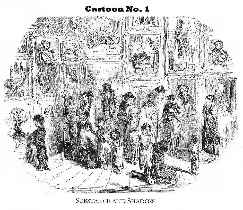
“Mr. Punch's cartoons.” The first of these, headed “Cartoon No. 1,” appeared in
the issue dated July 15, 1843, and was greeted (we may imagine) with snorts and
guffaws of cheerful appreciation. Leech pictured some of his favorite characters, a group of threadbare, poverty-stricken London street people, attending the exhibition of paintings that depicted a patriotic array of elaborately costumed and decorated dignitaries. The legend under the picture read, “Substance and Shadow.” And below it, a short text (supplied by Jerrold) completed the damning meaning of the cartoon: “The ministers have considerately determined that as they cannot afford to give hungry nakedness the substance which it covets, at least it shall have the shadow. The poor ask for bread, and the philanthropy of the State accords—an exhibition.” Not only did the first cartoon proclaim itself “Cartoon No.1,” but it blended word and picture in the fashion we have grown to expect in its descendants. Despite Punch’s signal contribution to the history of cartooning, most of the pictures in the magazine for many years were not cartoons in the modern sense—drawings yoked to captions to create a joke. They were, rather, comical comments upon or reflections of prose articles or simply humorous spot drawings dropped into the text. Sometimes they directly illustrated the text, making its satiric point. Looking at heavily texted pages of the magazine from the 1840s (and for several decades thereafter), today’s reader is likely to form the impression that the magazine’s comedy is achieved more by words than by pictures.
For some years after the advent of “Cartoon No.1,” Punch continued to call its humorous drawings “pencilings.” (Perhaps “jottings” would be an even more accurate term although “penciling” suggests the way the artists produced their work on woodblocks.) Eventually, it applied the term cartoon to any full-page satirical drawing. And then as captioned pictures grew more prevalent throughout the magazine, they, too, were called cartoons. But to the man in the street, any funny drawing in the magazine after the summer of 1843 was likely to be termed one of “Punch's cartoons,” and by this route, the word came into use for any comic drawing.
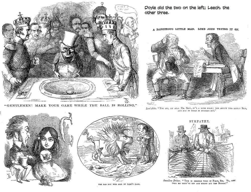
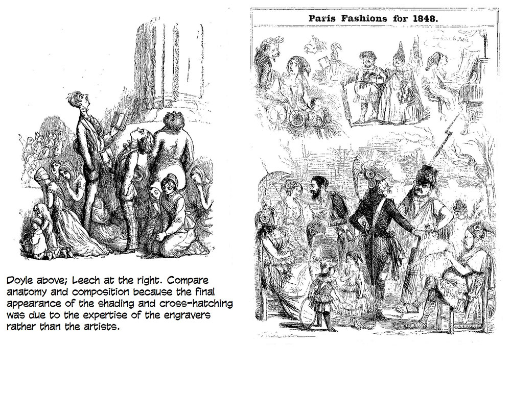
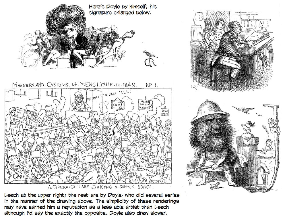
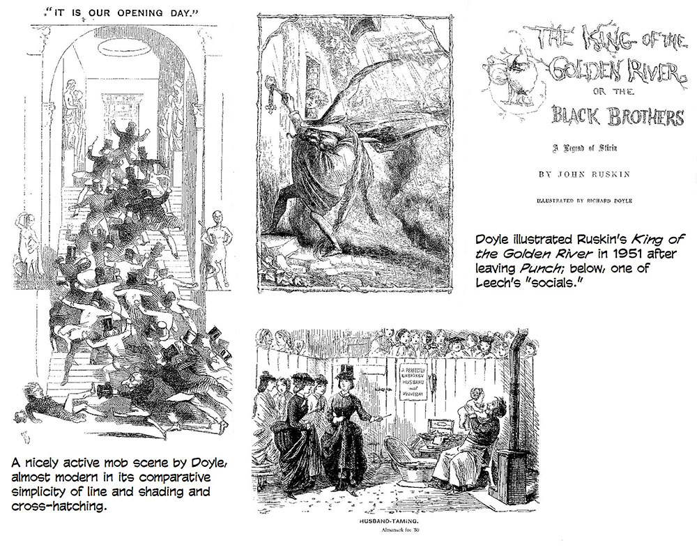
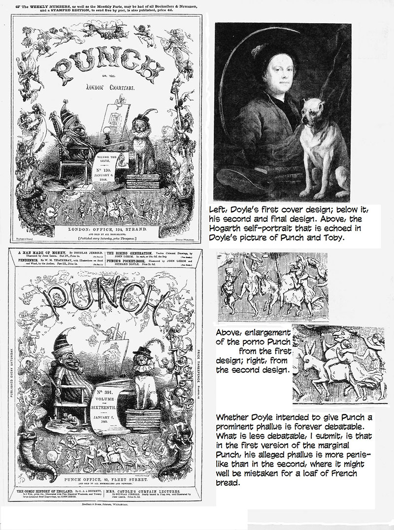
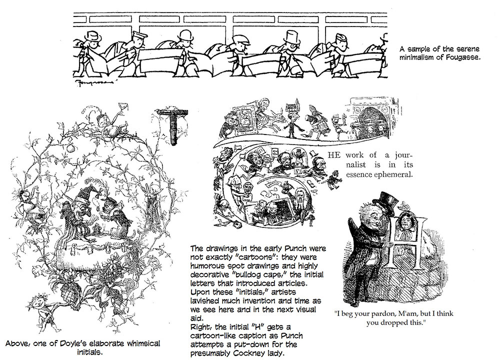
SECOND PLACE IN THE PECKING ORDER of popularity during the magazine’s first decade doubtless belongs to Richard Doyle, who signed his work with an “RD” monogram topped with a tiny “dicky bird.” Son of an accomplished political caricaturist, John Doyle, and uncle of a fabulously successful detective story writer, A. Conan Doyle, “Dicky” Doyle “had many of the gifts of the truly fine artist,” according to Stanley Appelbaum and Richard Kelly in their Great Drawings and Illustrations from Punch. “The chief one lacking,” they went on, “was the ability to draw. His father trained him by a defective method (forbidding the use of models, for instance) that kept Richard virtually an amateur, seemingly incapable of artistic growth, for his entire career.” What provoked Appelbaum and Kelly to this disparaging assessment is, to me, a mystery: I perhaps need my eyes examined, but to me Doyle’s drawings seem no more amateurish than those of many of his colleagues—even those of the pictorial master John Leech, for instance, some of whose pictures I’ve posted here with some of Doyle’s to demonstrate a nearly equivalent skill in execution. (In comparing the work of the two, look mostly for composition and anatomy rather than cross-hatching and other finishing details: while artists may have cross-hatched their drawings, whatever effects they intended were achieved by the engravers who converted their drawings into woodblock plates from which the pictures were printed.) Doyle’s figures sometimes seem a little stiffer than Leech’s, but Leech’s were not always entirely relaxed and natural.
In any event, despite the alleged disadvantage, Doyle was published by the time he was fifteen and was famous within a year. He joined Punch in 1843 but was not entirely comfortable in the boozy bonhomie around the Table. Doyle was a little prim and felt socially superior, says Price. He was also only 19 years old and doubtless felt a little inhibited by the company. But he “had a delightfully amusing laugh” and a somewhat shy demeanor, and his drawings, say Appelbaum and Kelly, had a “kindly wit, whimsy and charm that carried him through” albeit at the rate of only about one cartoon for every three of Leech’s. His
name survives in the annals of cartooning chiefly because he designed a cover
for Punch that was used for every issue until 1953 when humorist Malcolm
Muggeridge, then occupying the editor’s chair, began tinkering with the
magazine’s appearance in an effort to modernize the institution. Finally, in
1956, Doyle’s cover was altogether abandoned in favor of a new picture every
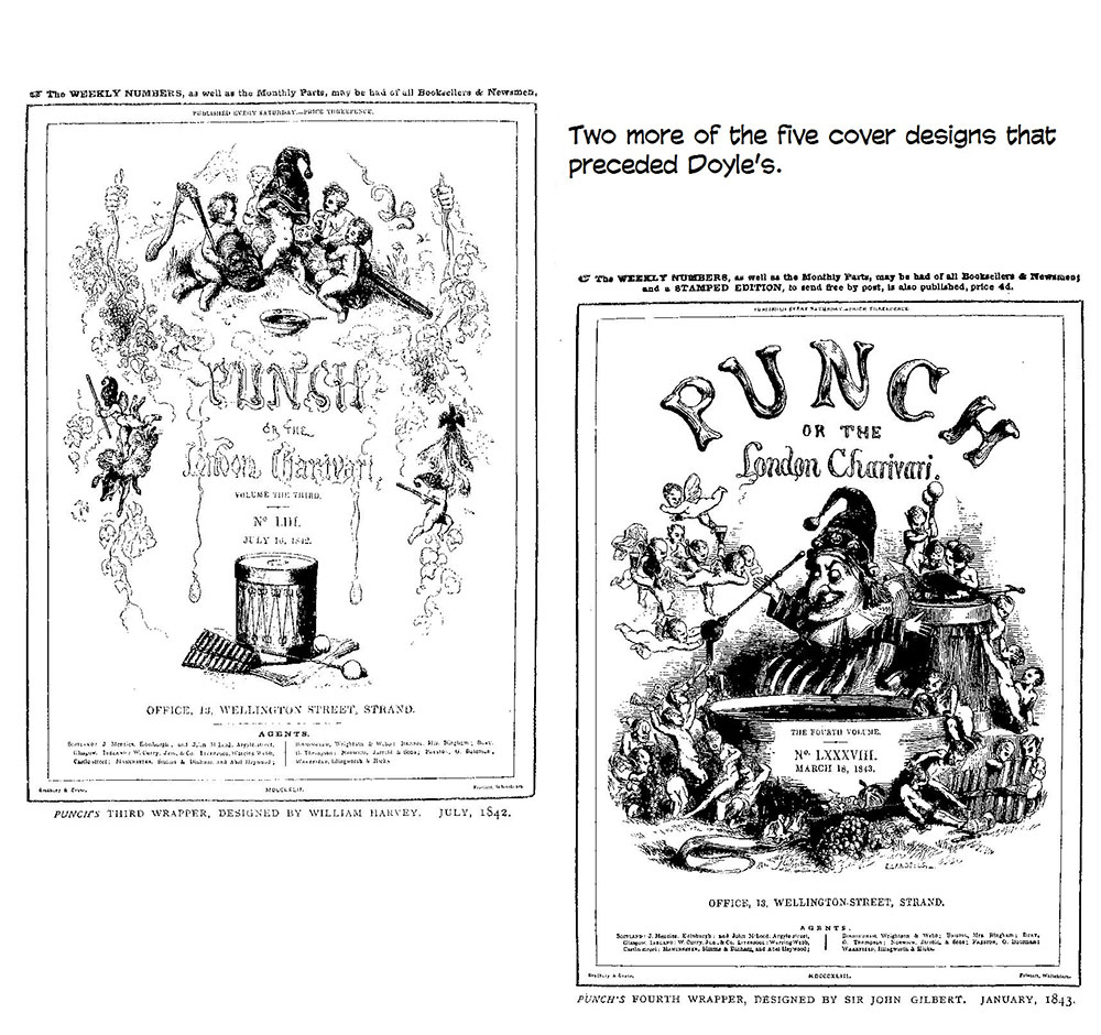
week. At the birth of the magazine, the cover was significant because full-page
drawings as covers were unusual on the newsstands of the day. Doyle’s first bid for popular acclaim in Punch was with a series of comic border designs, and his first cover for the magazine, which had been changing its cover every six months with each new volume, perpetuated this decorative motif with the annual almanac for 1944 issued in December 1843. Doyle scattered diminutive elves and gnomes up and down the sides and then drew a Bacchanalian procession of Punch astride an ass across the bottom, burlesquing a celebrated painting by Titian, which had recently been acquired by the National Gallery and was, therefore, in the news of the day and in the ready awareness of the magazine’s readers. In the center of the cover, Doyle depicted Punch as an artist at his easel, drawing a picture of Judy, his scold of a wife in the venerable street-corner puppet show. More visible than his spouse, however, is his familiar, the dog Toby, seated on a stack of books nearby. Readers of the day would recognize this tableau as an echo of a more famous painting, Hogarth’s self-portrait with his pug dog Trump seated near volumes of Shakespeare, Milton and Swift, reproductions of which had been regularly used as the frontispiece for popular bound sets of Hogarth’s engravings. This
design was used continuously for the next five years, and then in January 1849,
Doyle modified the drawing, simplifying some of the renderings and substituting
the British lion for the portrait of Judy on Punch’s easel. For the next 107
years, this cover would greet Punch’s readers every week. The allusive details in Doyle’s cover were typical of the magazine’s interior art, and his drawing was therefore the very emblem of Punch. The amusing pictorial details lurking throughout each issue demanded that the reader “read” the artwork as carefully as the verbiage in the magazine’s columns. Discovering these sight gags must have been, Richard D. Altick says, “a favorite game in early Victorian homes.” Among the possible sight gags was a particularly blatant one on Doyle’s cover. It is alleged by sundry wags and pranksters that Punch, in middle of the border frieze at the bottom, is fondling his erect phallus. Others say the object in his hand is just a loaf of French bread. Who can say for sure? Why are all the young women running so eagerly after him? Do they seek bread to eat or to be bred? Frankly, I doubt that Doyle, a devout Catholic and, by all accounts, a somewhat proper not to say priggish “Victorian” personality, would have any part in a pornographic comedy. He left Punch in November of the next year: he was insulted by an anti-papal cartoon that the Protestant Table insisted upon publishing to object to the Pope’s revival of Catholic hierarchy in England in 1850. It was time for changing the guard. Tenniel came in to replace Doyle; Thackeray left the next year to devote his energies more fully to his blossoming career as a novelist, and his place at the Table was taken by Shirley Brooks, perhaps the best writer the magazine would have for decades. At the same time, the artist Charles Keene began contributing.
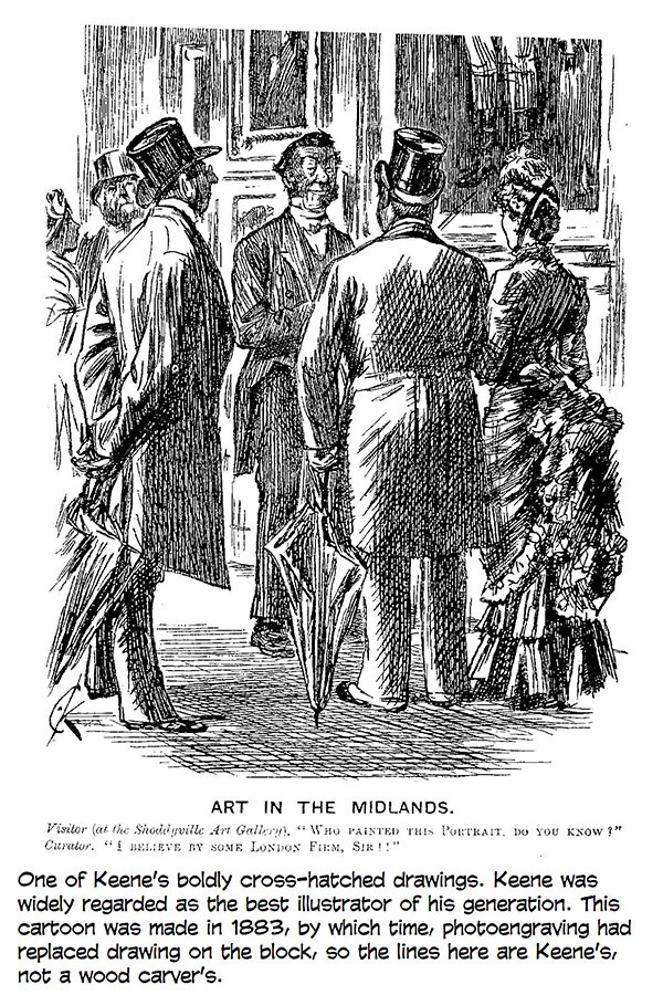
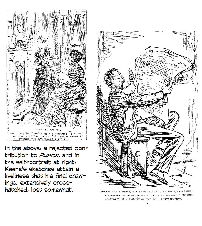
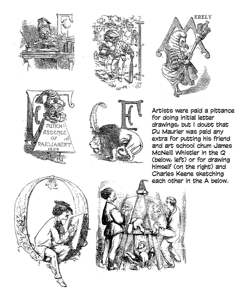
Keene, at the time the most highly regarded pen draftsman in England, did not join the Table until 1860 and even then declined a regular salary in order to avoid the constraint of having to contribute regularly. Still, between 1851 and 1890, he did 5,000-6,000 drawings for the magazine. He worked always from ideas furnished by others, and his pictures were often superfluous illustrations of verbal jokes. His artwork reportedly drove engravers mad: he used pale homemade ink and frequently employed a variety of washes, which the engravers would painstakingly try to reproduce with assorted patterns of cross-hatching.
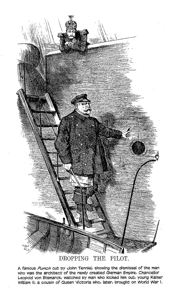
TENNIEL, WHOSE FAME as the illustrator of the Alice books in 1865 and 1872 eventually eclipsed his celebrity as the chief political cartoonist for Punch, had started his artistic career as a painter and illustrator. He had won a competition for a mural in the House of Lords (another case of “cartoon” as a preliminary sketch anticipating “cartoon” as a humorous drawing), but it was his illustrations of an 1848 edition of Aesop’s Fables that brought him to the attention of Punch. Although Tenniel was hesitant about his potential in a humor magazine, he stayed on for fifty years. He inherited the political cartoon when Leech opted for “socials,” and succeeded Leech as Punch’s chief cartoonist when Leech died unexpectedly in 1864 at the early age of 47. Leech had a pathological aversion to street sounds, a nervous disorder that may have contributed to his death. So extreme was his discomfort at noise that he soundproofed his house with double windows and heavy curtains. “Faced with a street grinder or noisy workman,” Price notes, “he went into a kind of nervous prostration.” The son of a fencing master, Tenniel had lost the use of an eye during sword play, and his vision dimmed over the years. He resigned his “Commission on Gen’l Punch’s Staff” in 1901 due to increasing blindness. By then, his Big Cut in Punch was virtually synonymous for political “cartoon” in common parlance.
The political cartoon had been his passion, and until he died in 1914, he had political articles read aloud to him, and as he listened, he sometimes gestured in the air, as if drawing, and said, “If only I could see—if only I could see! I could draw it now!” When he died, according to a somewhat fanciful but thoroughly Victorian report in the Daily Telegraph, his fingers held an imaginary pencil as if he were still drawing for Punch. The
last of the great mid-Victorian Punch cartoonists was another one-eyed
graphic genius, George du Maurier, who, after birth in Paris and childhood in a
variety of cities on the Continent, arrived in England in 1851 but returned to
Paris to study art in 1857. He proceeded subsequently to Antwerp, where he lost
the sight of his left eye (probably a detached retina) and where he saw Leech’s
work in Punch, and when he returned to England in 1860, he began
contributing to the magazine—and to other popular journals, earning a leading
position in the so-called renaissance of English draftsmanship in the 1860s.
Du Maurier succeeded to Leech’s chair at the Table and supplied a “romantic tenor” to supplement Keene’s “comic bass” until he died in 1896. He drew for other publications occasionally, including Harper’s Monthly in the U.S. for which he wrote and illustrated two novels, Peter Ibbetson (1891) and the famed Trilby (1894), that were published serially. Unlike Keene, Du Maurier left his engravers no leeway for interpretation: he drew precisely, tightly, directly on the block until 1872, and after that, for photoengraving, on paper but just as meticulously. Linley
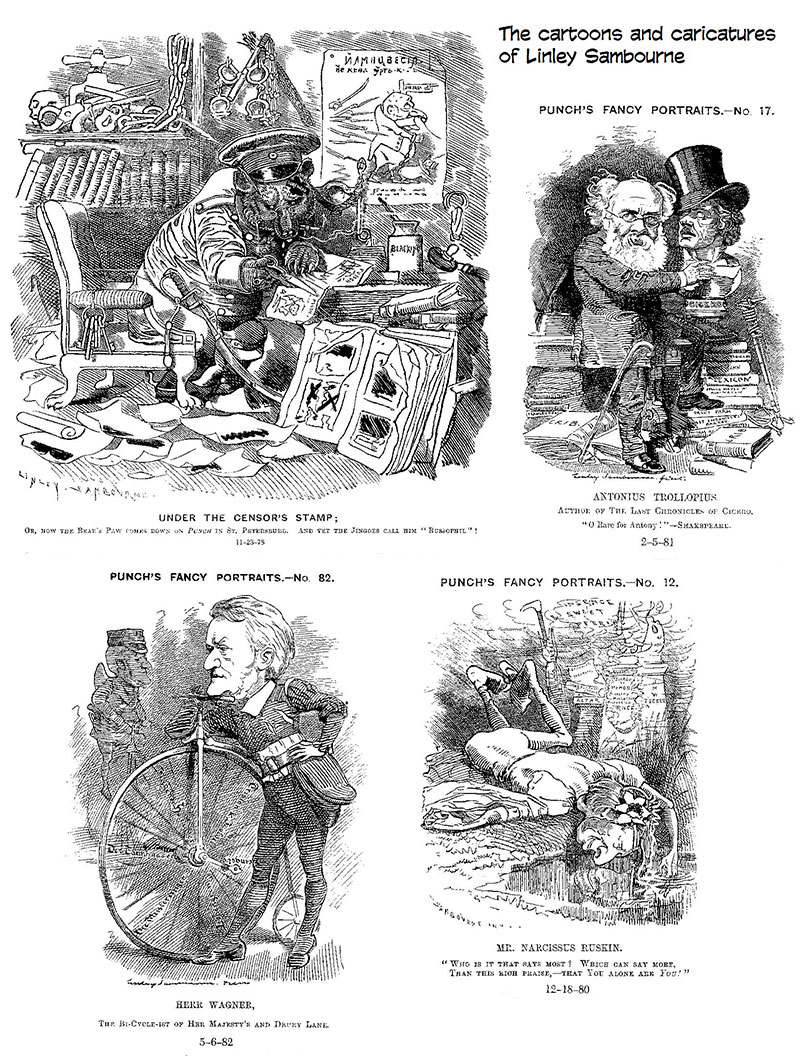
Sambourne, who began drawing for Punch in 1867 and joined the Table in
1871, may be, as Appelbaum and Kelly assert, “the greatest authentic genius
among 19th century Punch draftsmen,” who “developed a dazzling technique
in many different styles and blossomed into a fanciful artist of the first
magnitude, blending pictorial and decorative features into monumental and
unique full-page compositions.” In any case, his drawings display a bolder linear element than Leech or Tenniel or Keene, probably because, for much of his tenure, he was not working on the block. Sambourne’s renderings clearly benefit from the advent of the photoengraving process, but the most spectacular exemplar of these benefits is Phil May.
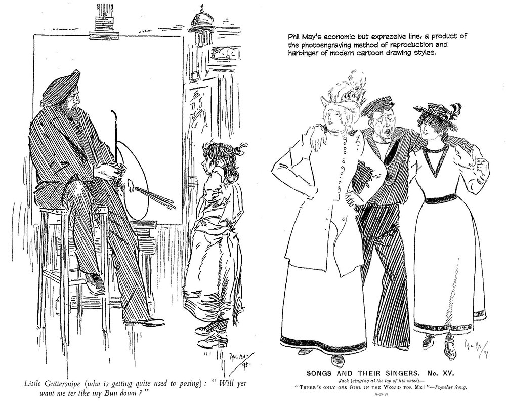
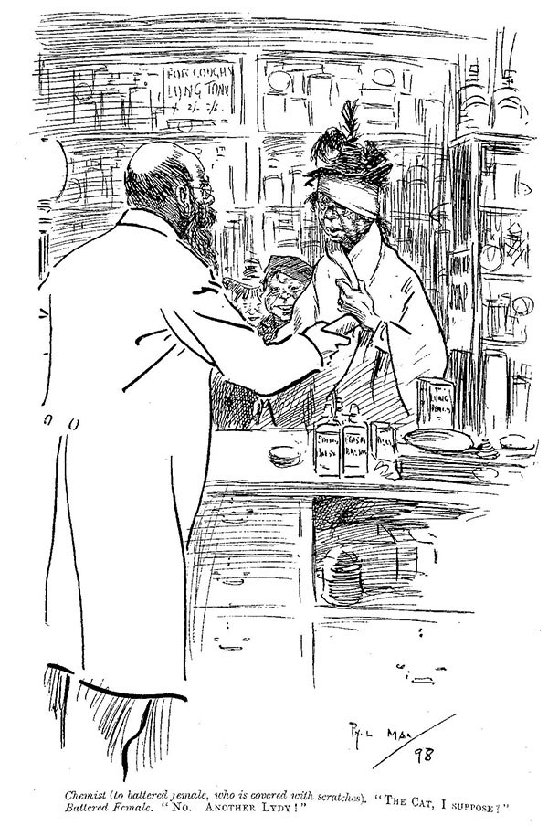
AL CAPP ONCE SAID that he was inspired—inflamed, even—by Phil May’s “line,” which, it is often proclaimed, is the first evidence of “modern” cartooning. Probably Capp, who was born in 1909, was repeating something he’d heard. Books reprinting May’s cartoons were around when Capp was learning to draw, but May had been dead since 1903. There is little question, however, that in May’s drawings we have the forerunner of the modern cartoon style of drawing. May came to London in 1883 at the age of nineteen, attracted attention with caricatures of theatrical personalities, and began to get magazine assignments but then was advised to go to Australia for his health. He worked for the Sydney Bulletin for three years then returned to London, via Rome and Paris. By this time, he had been an actor, a beggar (briefly upon arriving in London the first time), a handyman, wallpaper designer, solicitor’s clerk, estate agent’s clerk, and a piano duster in a music shop. He had no formal art training and very little schooling. A raffish, hard-drinking Bohemian, May dressed the part of the sportsman in bowler and velvet-collared coat, but poor health, Pager says, “had prevented him from anything more strenuous than the night life that eventually killed him.” May joined Punch in 1893 and carved his initials in the Table two years later, but he was never an enthusiastic participant in the weekly dinners. The alcoholic evening antics of the magazine’s early years were history by this time, and Punch’s men had become too thoroughly respectable and upper middle class for bowling pineapples down the Table. It was all too correct for May. He would drop in for a few minutes then leave in a waiting cab for livelier venues. Says Prager: “He worked hard and played harder, overtaxing his delicate constitution and weak lungs” and dying when he was merely thirty-nine. His metier was the lower classes and Bohemian London, in which he was personally experienced. After du Maurier’s fashionable middle-class domestic settings, May’s street scenes bustling with cockney urchins and wiley vendors were a fresh breeze, and Punch’s readers took May to their hearts. May’s drawings as well as his subjects were vividly different than anything else at the time in Punch. James McNeill Whistler said: “Modern black and white art [can] be summed up in two words—Phil May.” His pictures were made with a spare line, entirely naked of any cross-hatching. He deployed shading lines for tonal effects, but his pictures were essentially line drawings, expressive of a spontaneity in rendering unlike anything in woodcut reproduction.
May’s cartoons were supremely distinctive, recognizably May’s and no one else’s. And here is the great benefit to artists of the emergence of the photoengraving processes of modern printing: the lines of their drawings are reproduced exactly, or very nearly so, compared to the drawings of their predecessors. Those who worked on the block were dependent, utterly, for the final appearance of their work upon the skill of the engraver who chiseled away the wood from the lines the artist drew on the white-washed end grain of a tree stump. The method prevented much vitality in linear treatment and tended to homogenize graphic styles, beating them all into the same visual patterns. As a result, most of the early pictures in Punch, regardless of who drew them, looked very much alike. Kenneth Bird, one of Punch’s later editors (1949-1953) and a cartooning stylist of exquisite minimalism, wrote at length about such matters in The Good-tempered Pencil: “The necessary employment of this laborious method had a great effect on the style of draughtsmanship: its influence was all on the side of the static highly-finished fully-toned type of drawing, and all against the quick, stimulating, expressive drawing of a few but vital lines. Perhaps the artist felt that it was an insult to the block-cuter to give him a drawing with three or four lines and a squiggle—rather too much like flinging an inkpot in the face of the engraver. ... In any case, it was naturally more difficult to cut successfully a single quickly expressive vital line of subtly-varying thickness and equally subtly-varying curvature than to cut a series of lines that felt their way slowly and carefully round the form. And so, save for a few isolated individual rebellions here and there, the slow, solid, carefully-detailed drawing dominated the [printed] page. Then, in the 1880s, the revolution arrived, and it became possible to photograph a drawing straight on to a metal plate,” preserving every nuance of the artist’s line. Unfortunately, Bird continues, “British humor had by then become very set in its ways: fine academic drawing and the static wood-engraving approach were both so firmly established as necessities that quite a long time elapsed before artists in general made real use of their freedom. For the first twenty years of [the new photoengraving] process, in fact, much of the work produced was merely adaptation of the wood-engraving formulae of the early masters to the less exacting demands of the new method.” Phil May, however, was “the one great exception—the first major artist to take real advantage of process.” May, Bird concludes, “realized the possibilities from the start: the vitality of his work clearly owes a great deal to process—in fact, it could not have been satisfactorily reproduced without it—although its success was naturally mainly due to his individual qualities as a pioneer.” May demonstrated resoundingly, according to cartoonist/historian Draper Hill, “that photomechanical reproduction could emancipate line drawing from its Victorian cocoon of ritual hatchwork.” May’s pioneering doesn’t end with graphic technique, according to Prager. “Before May, it had always been necessary for comic artists to show their characters with expressionless faces” because the “joke” consisted of a relatively long exchange of dialogue in type beneath the picture, and if any of the persons in the picture had their mouths open or betrayed any emotion through facial expression, it might tend to undermine the comedy of the persiflage by distracting attention from it. But “May showed that cartoon characters could get an idea across with facial expression as well as with lengthy, involved cackles.” May made a great deal of money during a career that was as brilliant and short as a shooting star’s across the sky of London’s visual humor industry. He was surrounded by spongers and panhandlers, and his pay disappeared as fast as he collected it. And he could collect it pretty fast. When working for the Sketch, it is reported, he had an arrangement whereby he could do a quick drawing at the cashier’s office and cash it like a check, on the spot, in advance of publication.
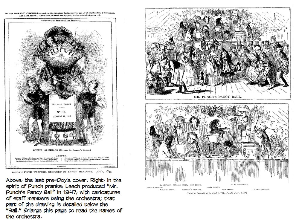
BY MAY’S TIME at Punch, Mark Lemon had been dead for 23 years, and the magazine, once a sprightly affront to the establishment with its perks and privileges, had become an institution, a part of the establishment, a somewhat stuffy part. It would regain its satirical edge briefly during World War I and for a few years thereafter, and it reached its peak of popularity and circulation in 1948. Then it began to slip again. In 1952, Muggeridge was installed as editor in an effort to rejuvenate the magazine. Immediately, he began casting out custom, willy nilly—changing the cover for one of the September 1953 issues, the first non-Doyle cover in 109 years—and focused on the comedy inspired by current events. “If a joke has no relevance,” he said, “or its connections are obsolete, it’s out.” The regular readers of Punch, as hide-bound by tradition as the magazine itself, were appalled at the rapid disappearance of well-mannered detachment with its distant decorum. But Muggeridge had a pithy response: “Good taste and humor are a contradiction in terms, like chaste whore.” At first, circulation improved, but Muggeridge’s tenure—ending in 1957—was short, perhaps because it was too iconoclastic. Other revival efforts also, ultimately, failed. In 1989, thirty-three-year-old David Thomas was hired to give the magazine a younger, hipper image, competing for readers with racier rivals, Private Eye and Viz. Alas, that, too, as I said when we loped off on this trip, flopped. Both the staff and the readers were nostalgic for what Punch had been. But, as an early editor is reported to have said, it has “always been never as funny as it used to be.” And in 1992, Punch shut it doors. Given a second chance in 1996, the editors again tried hipness to reach a younger audience, drenching the magazine’s pages with color photographs, shrieking display type, and circus-poster layout. The resulting product reminded me of a criticism leveled at the previous last gasp: it was a little like diluting a case of Chateau-Lafite with raspberry juice so it could be sold to young people on their way to school. In short, the flavor was gone. And soon, so was the magazine, the institution. But it had lasted a long time, carried forward through much of its 161-year history by the momentum given it in its formative years by a hack playwright and tavern keeper, whose managerial skills doubtless exceeded his comedic ones, and for whom conviviality was the secret to forming and shaping generations of contributors whose talents were equal to the task. Mark Lemon was editor of Punch longer than anyone else. Twenty-nine years. Of his successors, only Owen Seaman, who was editor from 1906 to 1932, came close. (It was during Seaman’s tenure that the Punch dinner became a lunch, in 1925.) “I was made for Punch,” Lemon once famously said, “and Punch for me. I should never have succeeded in any other way.” But the Punch way was a good way: it opened the door to many avenues, including the one that led to modern cartooning. By way of closing the door for the nonce, here are a couple of classic Punch cartoons, the stuff of legend, some of the magazine’s famed initial-letter drawings, and the rest of the pre-Doyle Punch covers.
|
|||||||||||||||||||||||