HOW THE HAPPY HARV FREELANCED CARTOONS
More Critiquing Antiques While Extolling The Dubious Virtues of Girlie Cartoons
FREELANCE CARTOONISTS live mostly on eraser crumbs. They have to. For most of them, there's very little money in the game: eraser crumbs are the most material (and hence the most edible) results of their work. Broiled eraser crumbs. Roast eraser crumbs. Fricasseed eraser crumbs. Eraser crumbs estouffade. Won ton soup with eraser crumbs as the wons. Or the tons.
Despite the crippling dietary deficiency associated with the craft, there were at one time hundreds—perhaps thousands—of freelance gag cartoonists in the United States. This situation was made possible because almost all single-panel gag cartoons printed in U.S. magazines are sold to those magazines through the mail. For the freelance cartoonist, there are no office hours, no time clocks to punch, no regular deadlines to meet. (Not much money, either—as I said.) Consequently, anyone can do gag cartoons from the safety and convenience of their own home if they have a few hours each week to work on them.
In those dear dead days of yore, dozens of magazines used cartoons. This was before art directors took over the magazines and banished cartoons because cartoons messed up those neat columns of gray type that were the art director’s chief design element: he/she needed columns of gray type in order to have something against which to play off swaths of color or vast expanses of white space. Cartoons, blotched with irregular interior shapes, undermined the cadenced geometry to which art directors aspired.
The magazines that used gag cartoons before the advent of art directors fell roughly into two large groups: trade journals (occupation-oriented magazines that are published for and sold to specialized audiences, either professions—like dentistry or farming or computer technology—or associations like the American Library Association or the American Bar Association); and, in the other group, all the rest of the magazines—those aimed at the mass market and sold on newsstands.
Within these two large groups, magazines could be divided into smaller groups according to their editorial focus: trade journals by occupation (medicine, law, auto sales, banking, etc.) and the others likewise by audience or subject (sports, travel, home-making, environmental concerns, and so on). In the latter category (“all the rest”) were two groups of magazines that, by the late 1950s, included the greatest number of magazines: "general interest" and "girlie."
"General interest" magazines were published for the general buying public, and they printed material on a wide range of subjects—magazines like the Saturday Evening Post. Back in the 1940s and 1950s when Collier's and Look and other similar general interest magazines were still being published, this category was much larger. "Girlie" magazines are those like Playboy and Penthouse, whose audiences are mostly male and whose subjects are mostly female (usually unclad).
The groupings I've sketched in so far determine the "slant" of cartoons, their subjects and the attitudes reflected in them. A cartoonist hoping to sell to medical trade journals drew cartoons about the medical profession—and the cartoons did not ridicule doctors. (Cartoons that laughed at doctors and nurses found their market in "general" magazines.)
The freelancer normally divided the magazines he/she hoped to sell into groups by "slant" and then, within each of these groups, he/she made an additional division—into "major" and "minor” markets. A major market was one that paid a high rate for cartoons (anything from $40 or $50 up); a minor market paid less (as little as $2-3 per cartoon). When the freelancer made up batches of cartoons (groups of 5-20 cartoon roughs with similar slant) and mailed them out, he/she customarily began by sending each new batch to the highest paying magazine that bought that slant. A cartoon editor may not buy more than one or two cartoons from a batch (if that), selecting the rough sketch that he/she wants from the batch and returning it to the cartoonist, asking for a finished drawing for that cartoon. At the same time, the editor returned the unpurchased cartoons to the freelancer in the self-addressed and stamped return envelope that the freelancer sent along with each batch.
The freelancer then shipped the remaining unsold cartoons off to the next-highest paying magazine in that slant group, repeating the process until he/she's sent the batch (whatever was left of it) to all magazines that might buy cartoons with that slant.
Although there were doubtless many freelance cartoonists in the U.S. back then, only a few made their living solely at freelance gag cartooning. We posted an interview with one of the last of them: Art Bouthillier (Harv’s Hindsight, April 2009); as you can see, he was surviving, heroically, in brutal conditions.
Cartoonists who made a living at their art in those days tended to be comic strip cartoonists whose strips were syndicated or illustrators of comic books. If a single-panel gag cartoonist made a living at it, his/her work was either syndicated and printed in dozens of newspapers across the country, or he/she produced an enormous quantity of cartoons for all trade journals and every other possible magazine market. A rule of thumb among freelance gag cartoonists was that if one expected to make a living from gag cartooning, he/she must keep at least 2,000 cartoons in the mail, making the rounds, at all times. One magazine gag cartoonist I knew kept 4,000 cartoons in circulation at all times. He sold to all markets. The bookkeeping alone (essential for determining which magazines have already seen which cartoons) was a half-time job; the rest of his time he devoted to drawing.
I was not one of those who made a living at it. Like hundreds of other freelancers, I did it part-time, as a hobby. Fifty years ago, when I was starting out to earn a living, I wanted to draw a comic strip. And I even prepared several sample strips, which I tried to peddle to newspaper feature syndicates. None of them sold.
In the mid-1960s, I lived in New York for a short time, and on Wednesday, known as “Look Day” because cartoon editors cleared their calendars that day to devote it entirely to looking at the cartoons brought to them, I joined the parade of cartoonists making the rounds of the offices of magazine cartoon editors to show them the product of the week’s labors. By tradition, the cartoonists out tripping the light fantastic on Wednesdays met for lunch to commiserate over their luck at selling cartoons or the lack thereof. They’d collect at the Palm or at the Pen and Pencil. They ate, they didn’t drink much. As one of them explained it to me decades later, most of them still had more cartoon editors to visit, and they needed their wits about them.
I knew this conviviality was taking place, but I was too bashful to go and introduce myself. Besides, I hadn’t sold a cartoon just yet, so it would be hard to claim I was a cartoonist except in the rankest way. So afflicted was I with shyness, that I never even introduced myself to any of the somewhat elderly gents I saw in magazine outer offices, waiting to see the cartoon editor. I was pretty sure some of these guys were cartoonists, but shyness tied my tongue.
After
about a month of Look Days, I finally sold a cartoon. To DuGent magazines. They
paid $25. I’ve posted this relic near here. (“Unexpurgated,” I should explain,
was at the time a term much in fashion: it was used to explain that Lady
Chatterley’s Lover, the D.H. Lawrence novel only lately released in this
country, contained all its original array of Anglo-Saxon words. Ditto Henry
Miller’s novels. Expurgated novels were bowdlerized for children’s
consumption.) 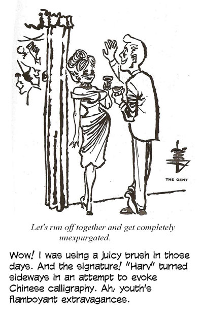
My cartooning career now secure, I left costly New York and found a transient hotel in downtown Denver on Court Place next to the neighborhood strip joint and started spending on postage stamps what I saved on shoe leather: I submitted cartoons by mail. I sold one of those, too, before the military caught up with me and I abandoned drawingboard for shipboard.
I intended to resume my cartooning career when I got out of the Navy (I’d discovered by then that it was, at best, but a fleeting thing), but I got side-tracked. To make a living, I started teaching school, and I eventually wound up working as advance man for a teachers' association. And while doing that, I moonlighted in graduate school. After earning a PhD, I had a little spare time on my hands, so I decided I'd try to re-enter the cartooning game by way of the magazine gag cartooning door. And I enjoyed drawing and a modest sales record for a few years.
I did mostly "girlie" cartoons. The reason was partly economics, partly accident, and partly personal. The economic part was a result of time and money. All the cartoons I circulated to potential buyers were finished drawings. I sent only finished art: I reasoned that since I was new at the game, editors wouldn’t know what my cartoons looked like if I sent only roughs. I’d planned to eventually send only roughs, but I never got to that point before I retired.
It takes a couple of hours to do the art, rough to finish, for each cartoon. Having invested that much time, I wanted the cartoon to have as many chances to sell as possible. If it didn’t sell in one place, I liked to have a dozen or more opportunities to sell the same slant cartoon elsewhere. And the two slant groups of magazines that had the longest list of markets were “generals” and “girlies.”
I worked both markets in order to have the greatest possibility for selling each cartoon. But I did more cartoons for the “girlie” market. The list of “general” magazines wasn’t as long as it had once been (and the buying public was increasingly being served by “special interest” magazine instead of “general interest” publications like the Saturday Evening Post), and the competition for sales to the highest paying “generals” was keen—much stiffer than the competition for sales to “girlies,” which, not being as respectable a market, attracted relatively fewer cartoonists. Although many aimed for both.
My chances of selling to a high paying men’s magazine were better than they were with high-paying “generals.” Or so I supposed. After all, I could draw a pretty nifty barenekkidwoman. And trade journals, which pay the lowest rates of any market, didn’t seem worth the two-hour effort each cartoon took when the pay was only $3-10 each. Moreover, the number of trade journals with the same slant—the number of potential buyers for a given cartoon—was smaller than the number buying “generals” or “girlies.”
When I first started freelancing, I worked both “general” and “girlie” markets equally. But I started selling more frequently to the “girlies,” so, following the accidental dictate of my
sales record, I began doing more cartoons for men’s magazines.
All these sober highly economic and strategic considerations aside, I also enjoyed doing “girlie” cartoons more than “generals.” Bill Ward, who drew voluptuous ladies for “girlies” for over 30 years, once gave the best reason for pushing a pen around hour-glass figures.
“Why did I become a sexy girl artist, you ask? My first day in art school, the instructor said, ‘I suggest you students concentrate on drawing what interests you the most. Those who are animal lovers, draw animals; those who are sports lovers, draw athletes; and so on.' Sooo," said Ward, "from then on, I've drawn girls."
There was yet another personal satisfaction. Men's magazines were then the only publications that printed cartoons in full color. And I enjoyed doing water-color versions of my cartoons, and for that, the girlie market was the only game in town.
I never sold to the two major men's magazines (Playboy and Penthouse), but virtually every other men's magazine printed one or more of my cartoons over the three or four years I played the game. And a couple of them ran a regular feature that I did. Back in those happy halcyon days, Playboy paid better than $300 for a black-and-white cartoon; around $1,300 for a full color 'toon; more now, as I understand it. The markets I sold to never took me into that bracket: they paid between $20 and $100.
Doing girlie cartoons takes more than drawing simmering little sexpots capering around the page in their altogethers. That’s the fun part, no question (and if you’re not having fun at what you’re doing, why bother?), but every one of those bawdy beauties must serve the ribald purpose of a joke, or else she’s just a wanton naked lady, lookin’ for work.
Gagwriters supplied most of my material when I was cartooning regularly. They sent in batches of 20-30 gag ideas written on 3x5-inch slips of paper. I picked the ones I liked and returned the rest. When a cartoon sold, I paid the gag-writer 25% of the sale. The prevailing rate for gagwriters was about 10-15%, but I thought I’d attract top flight gagwriters if I paid more. Dunno if that worked, but some years later, I noticed the names of a couple of “my” gagwriters listed among others that supplied Hank Ketcham with gags for Dennis the Menace.
In addition to looking for funny gags, I looked for gags that required a picture. Even way back then, I believed that a good cartoon should blend words and picture, neither making complete sense alone without the other. If I found a gag that was funny without a picture, it didn’t need to be a cartoon—and it was, therefore, a weak idea for a cartoon. Some gags simply can't be drawn. They're funny enough, but they require a setup or situation that can't be achieved in a single panel drawing.
After
I'd chosen a gag to draw, the real job began. The cartoon must be cast just as
a theatrical play must be cast: I cast each part by designing a character
appropriate to the part to be played. Then the drawing had to be composed—its
visual elements arranged in such a way as to tell a story, as much story as
necessary for understanding the joke, the punchline in the caption. By way of
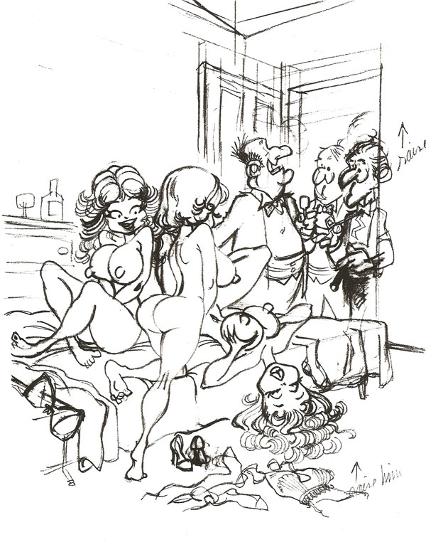
demonstrating the process, let me discuss the accompanying cartoon with the
caption, "Shall we join the ladies?" 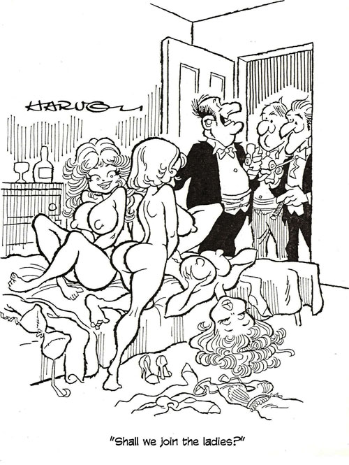
Casting in a girlie cartoon isn’t as complicated as it is for other types of panel cartoons. The girls are usually sexy; only the men must be cast with care. Here, I drew a fat man with an elevated nose in order to suggest the pomposity we associate with the wealthy—and also to suggest wealth, since, as I'll explain later, the cartoon seemed to require an upper class ambiance.
In composing a drawing, there are alternatives. One composition may not immediately occur to me as being the best—the undisputed single most effective way to tell a story visually in one picture. Eventually, though, I settled on one alternative or another. This cartoon, for instance, could have effectively employed a composition that completely reversed the positions of the characters as seen here. We would then see the girls in the background, over the shoulders of the three gentlemen standing in the foreground in the doorway. None of the gag's humor would be sacrificed in such an arrangement, but I elected to put the girls in the foreground. My choice was determined partly because putting the girls in the foreground would enable me to draw them larger, and since I like drawing sexpots large enough to see, I pleased myself in the decision.
This arrangement also seemed to make narrative sense. Although we may feel that we "take in" or "read" a cartoon all at once, we actually don’t. We see different elements at different times—albeit virtually instantaneously. I tried to set up a cartoon with the reader's "reading habit" in mind. Since we habitually read from left to right, I put the key visual elements at the left, where (so the reasoning runs) the reader is likely to see them almost at once before dropping his eye to the caption. If he doesn't "read" the whole drawing, at least he'll catch the most important of its narrative visual elements before going on to the caption. The idea is to arrange matters so that the reader will see all the cartoon's essentials first, at a glance.
Composition devices other than simple "reading order" can accomplish the purpose, too. We tend to see large things before small things. Perspective can direct the eye to an essential visual element. And solid black areas attract the eye quickly. All of these devices are deployed here.
The source of the humor in this cartoon, it seems to me, arises from coupling a cliche phrase to an unusual situation. The phrase "Shall we join the ladies?" is traditionally associated with the after dinner customs of elegant dining among the upper classes. After a cigar and a brandy in the study, the gentlemen rejoin the women whom they've left, momentarily, to domestic conversation after dinner.
The situation here violates that tradition by contradicting its elegant gentility: when these gentlemen join the ladies, they'll plunge into a sexual orgy. That is most humorously emphasized by focusing on the ladies—whom I depicted here as being ravenous for an after-dinner sexual romp. Although a reverse composition (with the ladies seen through the bedroom door, more-or-less in the background) could still have located the women at the left (first in reading order), they would have been drawn very small, and the visual emphasis would therefore have fallen on the men in the foreground.
In that arrangement, the men would have been drawn mostly from the rear—an uninteresting circumstance in itself but also one that prevents showing their facial expressions. The best solution, I decided, was the one I chose: I grouped the women at the left—in the foreground so they'd be large enough to permit me to show, in facial expression and body language, their rapacious sexual anticipation. In the alternative, with the women at a distance, I could scarcely show their eagerness in persuasive detail. The arrangement I chose also enabled me to show the gentlemen's expressions, to suggest both (a) a haughty casualness that one associates with those who dine elegantly and have after-dinner drinks apart from the ladies and (b) anticipation of the romp to come.
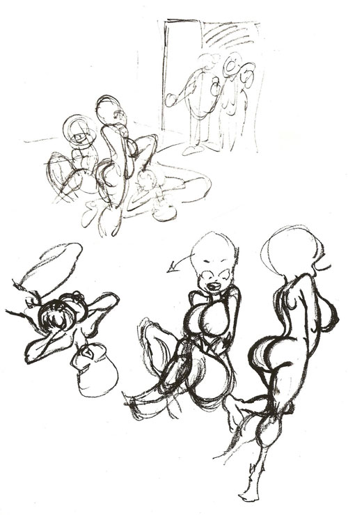
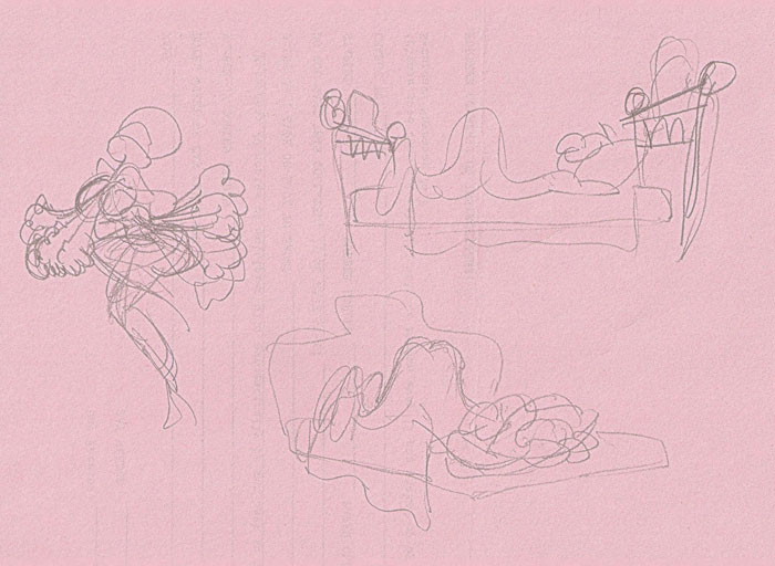
Initially, as you can tell from the thumbnail sketch I made first (top of the page on the left here), I envisioned the men at some distance from the bed in the foreground, the distance suggesting a large bedroom the kind one finds in mansions where people dine elegantly.
 |
 |
The thumbnail sketch is a quick drawing with virtually no detail; its purpose is to explore the composition I envisioned. After doing the thumbnail sketch, I started sketching the group of women, one at a time (bottom of the page), and then I went on to the first complete rough drawing (our next visual aid at the right), grouping the women closer together by tracing the rough sketches and, as I did them, moving the traced images closer together.
The drawing did not develop in quite the way I imagined it in the thumbnail. I got carried away limning the ladies and drew them too large: at this size, they didn't leave enough room in the 8.5x11-inch drawing area of my paper to develop the angle I'd originally envisioned for making the bedroom appear a large room. And the angle from which the women are seen didn't permit tilting the floor to create a sense of distance.
I could have re-drawn the group of women, making them smaller, which, in turn, would have allowed for a more spacious bedroom. But by the time I realized what was going awry, I’d done so much of the drawing that I didn’t want to abandon it. So I was stuck with what you see here. But it still seems to me that the cartoon functions just fine, leading the reader from one visual element to another in preparation for appreciating the caption.
In the rough, I drew the men too short, too close to the floor: if the fat fellow's legs are extended to their proper length, he'd be standing on the same level as the upside-down girl's head, a circumstance that the drawing's perspective does not permit. When making the final drawing, I raised the men up on the page to correct the problem.
Strictly speaking, I did not "ink” my final drawings. From the rough drawing, I made a pencil tracing on tissue paper. The pencil tracing I then photocopied on a Xerox machine, and that instantly "inked" all my penciled lines. To finish the drawing, I used a brush to fill in solid blacks and a felt-tip pen to do the shading. This procedure saved a good deal of time (I'm a slow inker), but it did more: it left me with a "master copy" of the cartoon—the pencil tracing. Since the U.S. Postal Service had a reputation for losing mail and since girlie magazine cartoon editors are similarly careless, the master copy I had on file permitted me to easily replace “lost” cartoons without having to re-draw them completely.
Another bonus: if the cartoon editor liked the cartoon and asked for it in color, the pencil tracing on file gave me the basic linework (with no solid blacks or shading that might interfere with coloring) for a color version without my having to do any re-drawing. I just took the master copy to the Xerox machine again, “inked” it, and then started to lay in the color.
No reader will take very long to read a cartoon. So the success of any single-panel cartoon depends upon how much assistance the cartoonist can give the reader in making sense of the situation quickly. The reader must grasp the implications of the drawing rapidly enough to understand the caption to which his eye doubtless drops after a second or so of looking at the picture. To this purpose, the cartoonist must make his/her drawing easily understood. It must be clear who and what the characters are, where they are, and who is speaking. The devices of composition assist in achieving these objectives.
In the cartoon I've been discussing, two other visual aspects assist in accomplishing these purposes—almost by accident. The converging lines of the slight perspective in the drawing all "point" to the fat man who is speaking. And the solid black of his tuxedo also draws attention to him. And to get to him, the reader’s eye passes by all the lewd ladies so the situation is clear. (Well, the reader probably starts with the ladies and not just because the reading habit in Western cultures is from left to right.)
Although all of this analysis may suggest that I consciously, methodically, thought through the composition of this cartoon as I did it, that’s not what happened. I drew it in the way it now appears because it “felt” like the right way to do the cartoon. The fact that now, long after the picture was done, the cartoon lends itself to the kind of analysis to which I’m subjecting it implies that my instinctive decisions about its composition were at least in tune with my more conscious attitudes about such things. Whether those conscious attitudes about the ways a reader views a cartoon are accurate is another matter—one best left to readers to judge.
Since I've done some strip cartooning as well as single-panel gag cartooning, I've had a chance to reflect on the differences between the two genre. There are technical differences: the multiple panels of a comic strip permit the cartoonist to “time” the action and to bring dramatic emphasis to aspects of that action by changing the "camera angle” and "camera distance” from panel to panel. In contrast, the single-panel cartoon cannot indulge in timing: the moment that is chosen for depicting the situation must, in itself, be the most telling for its narrative purpose. Although visual emphasis can be achieved in a single-panel cartoon by arranging such things as size of figures and their relative positions, the sort of dramatic emphasis possible in a comic strip can be accomplished only in conjunction with timing.
A comic strip also enables the cartoonist to develop the personalities of his characters. That's obviously true of a strip that runs for years—even months or weeks. But even a single installment—one strip—can develop a character's personality more thoroughly in its several panels than a gag cartoon can in a single panel. Consequently, the characters in the strips I've done seem more like living people to me than the characters who populate the panel cartoons I’ve done.
But gag cartooning has compensations. The drawings are seldom boring to do. Each cartoon requires a slightly different arrangement of visual elements, a slightly different cast of characters. And I was never faced with having to do a series of panels that depict characters talking and doing little else, a situation that frequently arises in doing a comic strip. There are numerous ways for a cartoonist to escape the kind of tedium that doing such a strip inflicts, but in doing panel cartoons, I never had to invent such ways to keep myself interested in the graphics. And I always had the time and imaginative energy to add little touches to the drawings that seemed to me to enhance the picture and its storytelling function.
In the cartoon at hand, for instance, I put a bottle and a glass on the dresser at the left, suggesting that the women have been making certain preparations for the mens’ visitation. Fragments of wardrobe strewn around the floor suggest that their preparation has not been quietly deliberate but eagerly frenzied, completed hastily while the fever of the moment lasts. I like the expressions on the faces of the two men just outside the doorway, and I can’t believe I took the time to show one of them untying his bow tie. Details like these amaze me now, years later, when I have lost all personal connection to the drawing and view it with the detachment that the distance of time fosters.
Assuming I can perform this mental gyration more than the single time we’ve just waded through, let me drag out of storage a few more instances of my own single-panel cartooning for whatever value they may have in providing a glimpse into a cartoonist’s so-called mind.
 |
 |
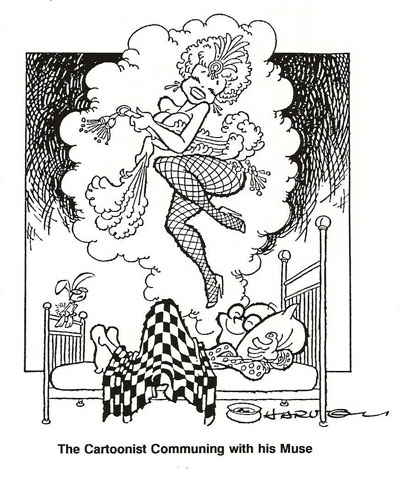 |
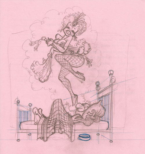
The first thing you’ll notice in the accompanying array of thumbnails, rough sketch, and finished art is that we’re not looking at a cartoon: it’s just a humorous drawing. The next thing you’ll no doubt notice is that the face of the dreamer in the rough has, in the finished art, been transmorgrified into a much handsomer visage—namely, my own. The reason is, as you must suppose, entirely egocentric.
The drawing started out as the cover of a printed program for a local theatrical production. I subsequently did minor surgery on the drawing, putting my face on the character in bed and sitting Cahoots on the bed railing. With those modifications, the picture served to decorate the back cover of a paperback compilation of my girlie cartoons. Entitled Not Just Another Pretty Face: The Confessions and Confections of a Girlie Cartoonist, the book is no longer in print, and I have in my possession the only inventory of any quantity in captivity. (You can have one for $25, including p&h, by writing me at the e-pistol address at the bottom of this scroll so I can tell you where to send the check.)
The drawing’s original purpose on the cover of a program booklet was to represent the show’s theme. The show was a revival of old-time burlesque in song and dance—no strippers but some of the songs had risque lyrics. The show's title, "I Had a Dream,” presented no difficulty: the idea for the cover was ready-made. I began with a couple thumb-nail sketches to determine the angle from which to present the fellow in the bed, dreaming. The straight profile (with some perspective) that I settled on would not have been my preference: as a rule, side views are not visually interesting. But in this case, I had little choice. I wanted to show the fellow embracing his pillow in a romantic trance and I wanted the bed to have brass railings at the foot and head (without which, I thought, it wouldn’t be clear that it was a bed the guy was lying on.)
I tried an alternative arrangement (seen below the sideview thumbnail), but it was obvious at once that it wouldn’t work. From any angle but the side, the brass railings would block the view of the dreamer's contented smile and amorous embrace. In order to show the dreamer’s face, I’d have to leave off the railing and switch him around, as seen, with his head at the foot of the bed. All too complicated, particularly when a straightforward profile would do the job.
The stripper presented only a mild difficulty: given community standards, she couldn't appear completely nude but she had to show enough skin to suggest that she was naked. I made her a fan dancer and placed one of the fans strategically. Then I raised her left leg to block the view of her lower anatomy. After making the first complete sketch, I ruled in perspective lines to get the bed railings right, then traced the drawing onto tissue paper in pencil; finally, I photocopied the pencil drawing to "ink" it, ruled in a border, and shaded behind the dream-balloon to make it stand out more. For use on the back cover of my book, I added a caption: The Cartoonist Communing with His Muse.
In the final drawing, I like the guy’s hand, which seems a perfect portrait of an impassioned clutch. And I have no idea why I thought putting a spittoon under the bed was such a good idea. It should have been a bedpan, but even if it were, why? Dunno. But it still seems to belong there even after all these years.
Neither
composition nor casting presented any challenge in the next cartoon. 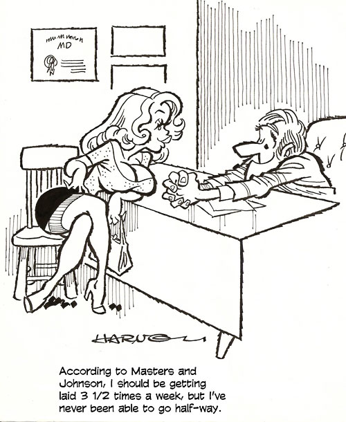 I needed only a
sexpot in a doctor’s office, the latter suggested by the tired conventions of a
desk and diploma on the wall. It’s a common setting, and one I got weary of
drawing. As I worked on this picture, though, I thought I’d have some fun with
the doctor. I wanted to do something different in an otherwise cliche
situation. So I first posed the girl wantonly, teasingly. And then I drew the
doctor to suggest that he is barely in control of himself: he’s clutching his
hands together, trying to prevent himself from reaching out and grabbing the
girl. My intention was to add an element of purely visual humor to the gag.
Clearly, I thought I succeeded, but it’s better if you think so, too. A visual
element that amuses me for its touch of realism: the girl’s right hand
indicates that, having just crossed her legs, she is adjusting her skirt. It’s
what every woman instinctively does. Stark realism.
I needed only a
sexpot in a doctor’s office, the latter suggested by the tired conventions of a
desk and diploma on the wall. It’s a common setting, and one I got weary of
drawing. As I worked on this picture, though, I thought I’d have some fun with
the doctor. I wanted to do something different in an otherwise cliche
situation. So I first posed the girl wantonly, teasingly. And then I drew the
doctor to suggest that he is barely in control of himself: he’s clutching his
hands together, trying to prevent himself from reaching out and grabbing the
girl. My intention was to add an element of purely visual humor to the gag.
Clearly, I thought I succeeded, but it’s better if you think so, too. A visual
element that amuses me for its touch of realism: the girl’s right hand
indicates that, having just crossed her legs, she is adjusting her skirt. It’s
what every woman instinctively does. Stark realism.
From
one doctor’s office to another, completely different in purpose and execution.
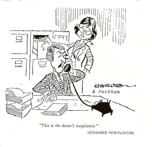 It may
strike you as monomaniacal, but I sent a couple of batches of cartoons to Playgirl magazine. My motive was somewhat political: if I ever gained notoriety as a
girlie cartoonist, I wanted to be able to claim a sale to a magazine notorious
for its female sexuality. My attitude was: Well, why not?—I’m selling erotic
comedy to men’s magazines, why not to the foremost representative of the
opposite experience? My only sale, however, was, as you see here, more in the
feminist vein than the erotic.
It may
strike you as monomaniacal, but I sent a couple of batches of cartoons to Playgirl magazine. My motive was somewhat political: if I ever gained notoriety as a
girlie cartoonist, I wanted to be able to claim a sale to a magazine notorious
for its female sexuality. My attitude was: Well, why not?—I’m selling erotic
comedy to men’s magazines, why not to the foremost representative of the
opposite experience? My only sale, however, was, as you see here, more in the
feminist vein than the erotic.
From the moment of conception, this joke had to go to a woman's magazine, preferably one with a feminist slant. Consequently, it was important that in casting the doctor I use an attractive woman but not necessarily a sexy one: she had to look capable as well as attractive, and a sexy woman would not suggest medical proficiency. The receptionist also had to look capable and attractive: if he looked like a nerd, that would say something about the kind of person that wound up being a male receptionist in a female doctor's office, and that, in turn, would reflect poorly on woman doctors—no feminist magazine would like that.
The problem in composition was to have the doctor present—visible—and identifiable as a doctor so that the reader would know instantly that the woman pictured was the doctor. I used some of the usual stereotypical props to label the woman as a doctor—stethoscope, white lab coat—and I arranged for her to be looking in the files as her receptionist answered the phone. (The name under my signature, incidentally, is the name of the gagwriter; at some point in the progress of my dabbling in this business, I thought I should give credit to the sources of my ideas.)
Every
gag cartoon is a challenge in casting as well as composition. Without proper casting here,
the yokel joke would fall flat. This joke also required an appropriate
setting—someplace where a fellow might wander up and ask to use a telephone.
The front desk in a hotel seemed likely. The cast had to include the country
bumpkin, the inspiration for the punning caption, and someone to deliver the
pun. And the guy talking had to have someone to talk to. Having spent a good
deal of my adult life checking into hotels, I knew that front desks are often
populated by front desk managers as well as room clerks. So my cast numbered
three. For added realism, I gave the front desk manager something to do with
his hands; you can't just have people standing there without doing something
that seems natural to them, and hands are a valuable anatomical appendage for
adding a touch of verisimilitude. Finally, I decided that the speaker should
look as if he knew he was making a bad pun—and savoring it vaguely anyhow. I’m
not sure I succeeded in conveying all of that: I think the tilt of his eyebrows
should be more extreme.
Without proper casting here,
the yokel joke would fall flat. This joke also required an appropriate
setting—someplace where a fellow might wander up and ask to use a telephone.
The front desk in a hotel seemed likely. The cast had to include the country
bumpkin, the inspiration for the punning caption, and someone to deliver the
pun. And the guy talking had to have someone to talk to. Having spent a good
deal of my adult life checking into hotels, I knew that front desks are often
populated by front desk managers as well as room clerks. So my cast numbered
three. For added realism, I gave the front desk manager something to do with
his hands; you can't just have people standing there without doing something
that seems natural to them, and hands are a valuable anatomical appendage for
adding a touch of verisimilitude. Finally, I decided that the speaker should
look as if he knew he was making a bad pun—and savoring it vaguely anyhow. I’m
not sure I succeeded in conveying all of that: I think the tilt of his eyebrows
should be more extreme.
I’ve been making an extravagant point by talking about the “reading order” in a cartoon, which, in this country, means your eyes habitually move from left to right. I think that’s helpful to keep in mind, but reading order can be trumped with sheer spectacle, as in our next exhibit.
Here
in this unpublished cartoon, the direction of the guy's glance and the thrust
of his jaw aids in my “reading order” plot against the reader by
"pointing" towards the girl's neckline. Which you must not miss:
without having seen the miracle of the lady's dress, you won't get much of a
chuckle out of the caption. Nicely reasoned, I’m sure; but the real reason we see
the girl’s accouterments first may be because we, at least the males among us,
are programmed from infancy to fasten on female mammaries. Left to right
reading order be damned. Survival is the driving force here: as infants, we
learn that to survive, we must eat.
Nicely reasoned, I’m sure; but the real reason we see
the girl’s accouterments first may be because we, at least the males among us,
are programmed from infancy to fasten on female mammaries. Left to right
reading order be damned. Survival is the driving force here: as infants, we
learn that to survive, we must eat.
Still, her bosom, however bountiful a feast for the reader’s roving eye, is at the left of the cartoon, the starting place in reading.
Left-to-right reading order is a powerful directive force, but I suspect that an impressive rack is at least as magnetic an eye-stopper.
TO TURN, for
the nonce, to another cartoonist and another cartoonist critic, here’s a 1946
cartoon by Chon Day, which The New Yorker’s cartoon editor, Bob Mankoff,
recently dubbed “the perfect cartoon” at his blog for November 30, 2011. (Go to
newyorker.com first; then look for Mankoff.) 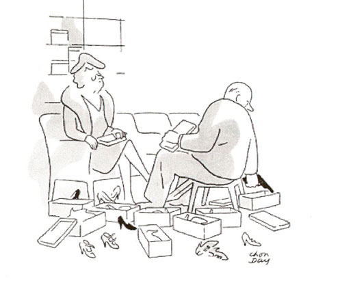 Mankoff analyzes this cartoon as follows:
“Day created his characters with great economy to engage both our empathy and antipathy. The woman is a cold, imperious, impossible-to-please dowager for whom we have no compassion. The salesman’s back is turned to us, his features obscured and intentionally nondescript so that we can project ourselves on to his suffering. Next, let’s look at the graphic machinery.
“Our gaze drops down from the face of the dowager, then to the right [across the bottom of the picture]—first onto the form of a black shoe immediately beneath her, then a second black shoe, and then a gun. The two black shoes delay, ever so slightly, our perception of the gun as a gun, thereby heightening the surprise. On the level of human dynamics and the psychology of perception, this is a perfect cartoon.”
Mankoff’s is a canny analysis, born of years of pawing through vast landscapes of cartoon submissions. But you’ll notice that his critique begins at the left of Day’s picture—with the dowdy dowager’s glacial facial expression. After that, by Mankoff’s reasoning, the reader’s eye is attracted by black shapes, and so we go from one to the next, still in reading order, until we get to the visual punchline.
At the very least, roping Mankoff into this disquisition proves that my critiques of cartoons are not aberrations. His are kindred, and he’s more experienced at this than I.
Still
pursuing the efficacy of reading order in the composition of panel cartoons,
here’s an antique ’toon of mine, done during those years I mentioned that I was
bounding over the heaving main (or vice versa) in the U.S. Navy. 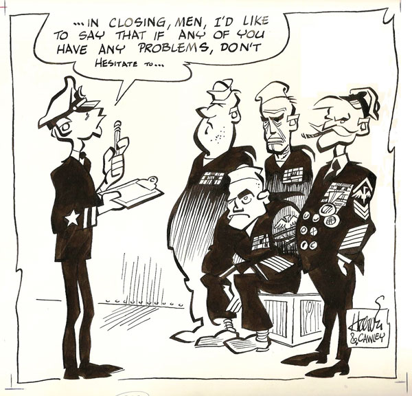 The joke here, which is
probably more obvious to active-duty sailors than it is to most civilians, lies
in the extreme unlikelihood of a young, inexperienced officer (on the left)
being able help solve any problems that might be encountered by any of the
experienced old seadogs in his division.
The joke here, which is
probably more obvious to active-duty sailors than it is to most civilians, lies
in the extreme unlikelihood of a young, inexperienced officer (on the left)
being able help solve any problems that might be encountered by any of the
experienced old seadogs in his division.
The lower echelons of the officer ranks in the Navy are made up entirely of fresh young college graduates who, as a matter of routine, are expected to command divisions of older more experienced people, who know more about what the officer is supposed to know than he/she does. The Navy runs on the supposition, unlikely but proven over and over, that these green young things can somehow make it work. To that purpose, every young, inexperienced officer in the Navy is expected to make just the sort of speech this guy is making. Dutifully, he makes the speech, but as he does, he contemplates the raw experience on display before him, and he realizes how ludicrous his offer is, and his speech dies on his lips. As it should.
The joke is self-evident in the circumstance. All I had to do was to create characters whose appearance would instantly proclaim the contrast of experience and inexperience. If the weather-beaten faces don’t serve to establish how seasoned the veteran sailors are, the decorations on their chests do. And the ensign’s inexperience is indicated by his apparent youth in contrast to the evident age lined up before him.
The question looming over this specimen is whether the composition ought to be reversed, with the line-up of grizzled old seafarers coming first in reading order rather than last. As I start off in this direction, I’m not sure.
In the aftermath of examining Mankoff’s critique and its implicit reliance on reading order, I remembered this cartoon. I decided it would be a good example of how important reading order is: the cartoon is essential a line-up that we read from left to right, the joke emerging as we assemble information by reading down the line until we get to the end, when—bingo!—some element in the line-up springs the punchline.
Oddly, in my memory, the composition of this cartoon is completely reversed.
So I was surprised when I dug up this dog-eared relic to see that the young, inexperienced wet-behind-the-ears ensign appears first in reading order. Encountering the cartoon, we read the speech balloon first, then the picture: going left to right, then, we see the young guy first, then the old sailors. The age of the sailors, their evident experience, explains why the young officer’s words fizzle out as he speaks.
And that’s how a single-panel cartoon is supposed to work: if the picture is a puzzle, the words explain the puzzle; and vice versa. Here, the picture explains why the high-sounding words fade out.
How would it work if the composition were reversed? Probably the same way. We’d read the speech, but probably not until after seeing the line-up of the old guys. And then we’d see the young officer. Would the speech then “explain” the picture? Probably. And the joke would survive.
But it seems to me that it’s funnier the way we have it here. Reading order clearly lets the picture explain the speech. And it’s not until we’ve read through the picture, left to right, that we understand what’s funny. In the reversed composition, I think the situation emerges slowly, without, strictly speaking, a “final moment” defined by the punchline. In the cartoon before us, I think the “explanation” of the “puzzle” is more of a surprise and, hence, a better punchline.
I like this drawing—the stark solid blacks, the chiseled legs dangling from bodies, the lines that wax and wane from thick to thin.
Incidentally—to
toot my own trumpet for a minute (and why not? it’s my website, isn’t it? and
the title of this essay is all about me, right? so, no surprise)—this cartoon
won first place in the All Navy Cartoon Contest in 1961. 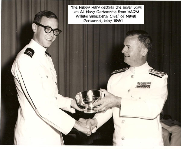 I was in the Navy for two
more years, but I never entered again. It’s not as if I didn’t want to press my
luck: I just never heard about the contest again. I tried to give credit for
the gag to the person I thought had given it to me, Russ Cawley, who was in my
company at Supply Corps School. Alas, my memory was, even then, showing serious
signs of deterioration: later, sad to say, another shipmate came to me and
reminded me that he, Andy Burton, not Cawley, had given me the idea. The
original of this cartoon, which I still have, is inscribed to Andy by way of
apology. But since I still have the original, I guess I never ran into him
again to give it to him. Andy? If you’re out there, send me a note, and I’ll
send you the original art for the cartoon.
I was in the Navy for two
more years, but I never entered again. It’s not as if I didn’t want to press my
luck: I just never heard about the contest again. I tried to give credit for
the gag to the person I thought had given it to me, Russ Cawley, who was in my
company at Supply Corps School. Alas, my memory was, even then, showing serious
signs of deterioration: later, sad to say, another shipmate came to me and
reminded me that he, Andy Burton, not Cawley, had given me the idea. The
original of this cartoon, which I still have, is inscribed to Andy by way of
apology. But since I still have the original, I guess I never ran into him
again to give it to him. Andy? If you’re out there, send me a note, and I’ll
send you the original art for the cartoon.
TO RETURN NOW
TO HAPPY HARV ’TOONS that enable us to prolong our earlier udderly fascinating
contemplation of female headlights as symbolizing mealtime, here’s a cartoon
alluding to the same survival skill. It’s also a drawing in which solid black
is the operative visual strategy: the blacks pull our eyes immediately to the
speaker and her dilemma. But facial expression is vital here, too.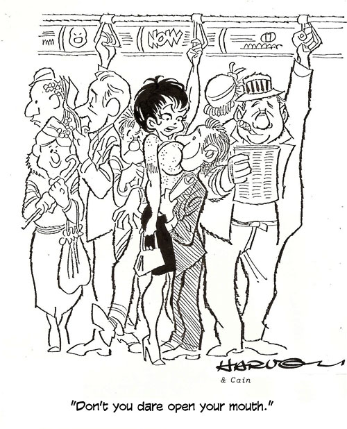
Facial expressions can change the tone, mood—even the meaning—of a cartoon. If the short guy here were leering lustfully, the cartoon would become much more heavy-handed and bawdy. And the girl's words would seem less forceful, less likely to be obeyed. As it is, we're not sure what the guy will do: he looks a little embarrassed and intimidated, but at the same time, he's clearly enjoying himself. The likelihood is that he will do just what the girl has commanded—no more (and, bless his lustful heart, no less!)—and that, I submit, adds to the humor of the situation. In fact, the cartoon might not be funny at all if he had a predatory expression on his mug.
There were other satisfactions for me in doing the drawing. Essential to the workings of the gag was a crowded subway train. I’m not big on drawing crowds, so I wasn’t eager to begin this assignment. But once I got into it, I found compensating pleasures. The guy on the right was a throwaway: just part of the population. But at the left, I was having some fun. Immediately behind the girl is a guy being squeezed by the crowd. Next to him, a guy with his nose buried in the newspaper. And next, a little old lady in fear of her life: she’s smiling, but the smile is apprehensive. Subway cars are full of threatening thugs and juvenile hoodlums. She clutches her cane, holding it like a weapon should she need to defend herself.
All the activity among the subordinate characters in this picture could draw too much attention to them, so I kept the linework simple and unembellished so this part of the drawing would tend to fade into the background in comparison to the visual strength of the principals of the gag.
Next,
to take up again the girlie cartoon’s standard fare, barenekkidwimmin, we have
one in which the wimmin are not only naked but fully formed and ripely rounded
in all the right places.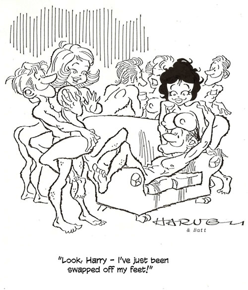 The sex orgy is another cliche in girlie cartoon situations.
And like most girlie cartoons, this one had to feature sexy girls. Like anyone
who draws sexy girls by concentrating on the epidermis, I got bored drawing
them in the same poses over and over. Adam Hughes, celebrated for his
spectacular renderings of superheroines, undoubtedly has the same problem, and
he solves it the same way I did, by varying the poses, often to extremes. And
that’s what I did here, trying for a variety of poses—and for some visual
humor, in quest of which, I conjured up the most outlandish poses I could think
of. Nothing about the couple on the right, for instance, requires that the girl
be resting her boobs on the guy’s forehead, but their situation seems funnier
than if they’d simply been embracing each other on the couch. (It’s entirely
coincidental that the guy, Harry, looks vaguely like Hugh Hefner.)
The sex orgy is another cliche in girlie cartoon situations.
And like most girlie cartoons, this one had to feature sexy girls. Like anyone
who draws sexy girls by concentrating on the epidermis, I got bored drawing
them in the same poses over and over. Adam Hughes, celebrated for his
spectacular renderings of superheroines, undoubtedly has the same problem, and
he solves it the same way I did, by varying the poses, often to extremes. And
that’s what I did here, trying for a variety of poses—and for some visual
humor, in quest of which, I conjured up the most outlandish poses I could think
of. Nothing about the couple on the right, for instance, requires that the girl
be resting her boobs on the guy’s forehead, but their situation seems funnier
than if they’d simply been embracing each other on the couch. (It’s entirely
coincidental that the guy, Harry, looks vaguely like Hugh Hefner.)
And the couple on the left, the pivot of the joke, could show the girl being “swept off her feet” by simply depicting him holding her in his arms like a leggy sack, feet in the air. But this pose struck me as funnier because it exaggerates. And it’s sexier, too. The guy is clearly absorbed in massaging her left boob, and it, like the two shading Hefner’s eyes, seems to cry out for massaging. (Ooops! Sorry. I’ve just surrendered to my own libido, which, truth to tell, governs many of the decisions I make in drawing a girlie cartoon. Other girlie cartoonists might achieve comedy in this cartoon with a simple ensemble of undressed people. And that’s fine. I, however, liked my naked wimmin to look tempting, imminently grabbable.)
I like the casual, relaxed look of the drawing here. The linework is almost loose, which I regard as an achievement in pictures as complicated anatomically as these. And I like the hands, too: they’re all doing real things, and the men’s hands are boney in nice contrast to the presumed softness of the things they’re handling.
It was a mistake, probably, to make Harry Hef’s girl a brunette. Since black attracts the eye, we no doubt see her first in contemplating the picture, and she has nothing to do with the pun in the caption. Still, we also “read” from left to right, and the punning girl is on the left, the first we see in reading order. That, however, is not enough. In the last analysis, I probably sabotaged my composition with that head of dark hair.
Before
abandoning the subject of grabbability as a desirable attribute in picturing
the lewdly light-hearted ladies of my girlie cartoons, here’s a “how to draw a
sexpot” guide I developed for an article I did several eons ago for the
legendary Rocket’s Blast Comic Collector fanzine.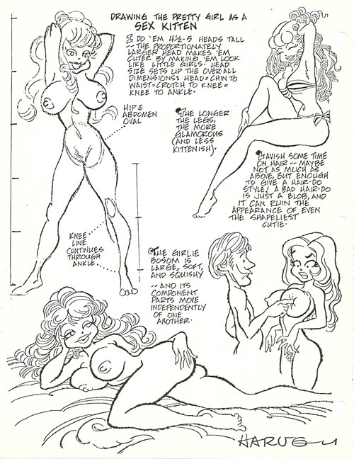 It speaks for itself, I’d
say. And while I think the advice it imparts is sound, it also reveals (ooops!)
my libido in firm command of my visual sensibilities.
It speaks for itself, I’d
say. And while I think the advice it imparts is sound, it also reveals (ooops!)
my libido in firm command of my visual sensibilities.
Most
of the pictures in the guide I clipped from cartoons I’d drawn. The guy
demonstrating the soft squishiness of the girlie boob by poking it (lower
right) is taken, along with the girl, from the two-panel cartoon just here, in
the corner of your eye. 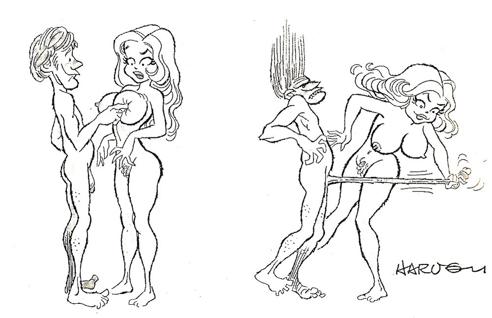 The gag here is my own invention, and I think you can see the
genesis and evolution of the comedy. The guy surrenders to the temptation to
test the squishiness of his girl’s hooter (my libido again), and what’s her
response likely to be? She’s going to throw her arms around him and cover him
with kisses? Sure. That’s what he hopes (and us, too). But what if she resents
his obvious preoccupation with her anatomy instead of her personality? Then she
might do something like she does in this cartoon.
The gag here is my own invention, and I think you can see the
genesis and evolution of the comedy. The guy surrenders to the temptation to
test the squishiness of his girl’s hooter (my libido again), and what’s her
response likely to be? She’s going to throw her arms around him and cover him
with kisses? Sure. That’s what he hopes (and us, too). But what if she resents
his obvious preoccupation with her anatomy instead of her personality? Then she
might do something like she does in this cartoon.
Seemed an entirely logical progression of events to me. (See? My libido isn’t in control all of the time; sometimes my so-called mind kicks in.)
Our
last exhibit is another instance of logical progression—in two doses. The first
dose is the single panel cartoon at hand.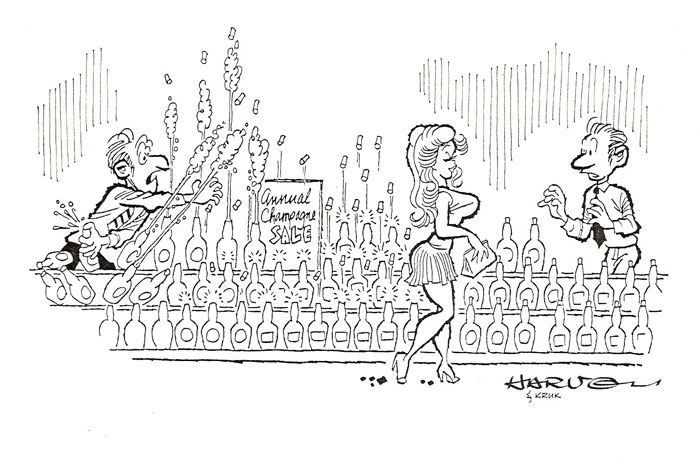 This cartoon was a lot of fun to do. I've
presented it here in its original incarnation, as a single panel gag cartoon,
and then again, down the scroll, in comic strip form in order to make a point
about the differences between a panel cartoon and a comic strip. Before making
that point, however, let's look at the single panel drawing.
This cartoon was a lot of fun to do. I've
presented it here in its original incarnation, as a single panel gag cartoon,
and then again, down the scroll, in comic strip form in order to make a point
about the differences between a panel cartoon and a comic strip. Before making
that point, however, let's look at the single panel drawing.
The straight side-view does not make for the most dramatic drawing (a perspective view with the girl walking towards us or away from us would have been more dramatic visually), but the side-view has the advantage of presenting the situation in the clearest way. It is, perhaps, the only way to present the situation clearly. The composition is set up for a reader's habitual left-to-right reading. And once I'd determined this much about the design of the cartoon, I began to play with the situation.
The gagwriter sent me just the barest gist of the joke: a sexy girl walks along the line of a shelf of champagne bottles, and the bottles blow their corks as she goes by. As I thought about it, I realized that the girl walking along a shelf line of champagne bottles suggested the passage of time: her radiant sexuality is popping the champagne bottle corks just as she passes the bottles, and after a champagne bottle pops its cork, what happens? The contents foam and squirt forth. The girl is far enough away from the man at the left to suggest that enough time has lapsed since she passed the bottles in front of him that those bottles should now be foaming and squirting. So I showed the bottles doing just that.
Then I figured that an attentive store clerk would try (albeit vainly) to save as much of his champagne as he could, so I showed him desperately—pointlessly—trying to stop the champagne volcano in mid-eruption. Meanwhile, at the right, I decided to put in a second liquor store clerk—this one, seeing what's happening to the stock of champagne, in a paralyzing quandary about what he should do. The girl, of course, is oblivious to everything around her.
The reader, I thought, could find humor in the over-all situation—and in the dilemmas of the two store clerks. And reading the cartoon would be a bit like watching an event as it was unfolding—the full import of the situation slowly dawning on the reader as he reads from left to right.
The
comic strip format emphasizes this last aspect of the cartoon—timing. 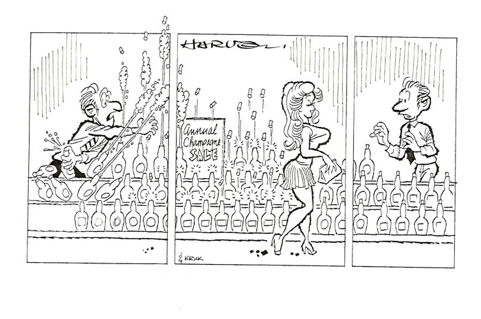 Dividing the
drawing into three panels has the effect of creating three separate moments in
time, and the attention of the reader is focused on each moment in
turn—something a panel cartoon, however carefully constructed, cannot do as
deliberately or with as much success as a comic strip.
Dividing the
drawing into three panels has the effect of creating three separate moments in
time, and the attention of the reader is focused on each moment in
turn—something a panel cartoon, however carefully constructed, cannot do as
deliberately or with as much success as a comic strip.
In the first panel, or moment, we see the desperate store clerk, trying to control the effusion of his bottles. The second panel explains the cause of his predicament—and the second panel is, strictly speaking, the punchline of the strip. But the third panel is the actual ending of the strip. It focuses exclusively on the clerk and his quandary and his paralysis—it dwells on him. We're forced to consider him longer than we are in the panel cartoon—long enough, perhaps, to enable us to ponder what he's thinking. And as we ponder, we may find an element of humor in his situation that we might overlook in the quick reading we normally give a panel cartoon.
While the strip functions to illustrate the timing aspect of comic strip cartooning—one of the form’s most distinctive properties, as I mentioned earlier—our comparison of the same cartoon in panel form and in strip form reveals yet another essential difference between the two forms: a strip can focus our attention more precisely. The comic strip cartoonist can therefore direct the response of his reader more exactly than the panel cartoonist can.
I enjoyed doing both kinds of comics, strips and panels—strips for their capacity for timing and for developing the personalities of the characters; panels because of the variety of situations I got to illustrate comically. Eventually, I decided that I liked writing better than drawing, and in favor of the former, I have almost given up the later. But as long as my interest in making cartoons prevailed, I went merrily on my way those many moons ago—drawing funny pictures of sexy girls and flinging another pot of eraser crumbs on the stove.