Revisiting the Maturing of the Comic Book: A Quick Eccentrially Skewed Tour of The Crucial 1970-1990s FROM FIGURE DRAWING TO STORYTELLING From Corporate Creation to Individual Expression
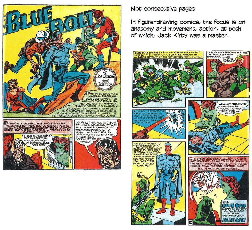
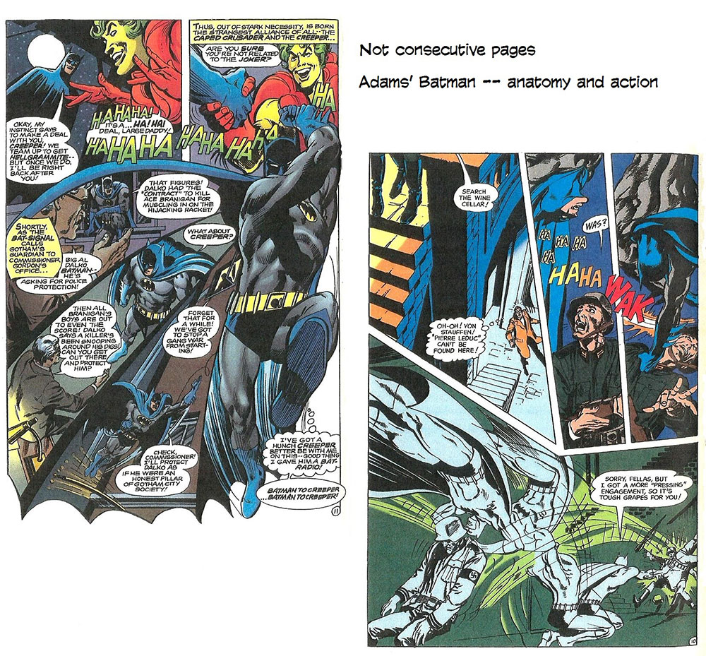
BY THE END OF THE EIGHTIES, the situation in mainstream comic book production had changed greatly. In addition to being paid set fees per page, creators could earn royalties based upon the sales of the their comic books and sometimes a percentage of the ancillary revenue generated by merchandising the characters. They also retained ownership of their original art (a development originating in the underground), and they sometimes owned the characters they concocted. As the 1990s dawned, the economy of the comic book industry had been so violently altered that a cartoonist producing comic books could become very wealthy. Indeed, some, riding the crest of momentary fan adulation, became millionaires overnight. While underground comix were revolutionizing the comic book economy in this country in the late 1960s and early 1970s, they were also influencing content abroad. European comics blossomed under an arrangement quite different from the American system. Newspaper feature syndication doesn't exist; newspaper comic strips are produced for individual publications only. Most cartooning on a national scale takes place in magazine format. Cartoonists draw for weeklies that print multiple-issue stories in 4-6 page installments. After the initial printing in serial form, the pages are collected and re-issued in hardbound "albums." Comic books in Europe are, therefore, real books, not magazines. And they have a cultural status that American comic books would not achieve for years. Moreover, the production values in European comics were much higher: the colors are applied in a painterly fashion, not mechanically by overlays (as in the U.S.), and the full-color art is printed on high quality coated stock. Comic book art in Europe is beautiful to look at because the visual character of the work is carefully created and then enhanced by the manner of publication. European cartoonists were as astonished and liberated by American underground cartoonists as those cartoonists had been by Harvey Kurtzman and Mad. Mad, in fact, was as much an inspiration overseas as it had been in the U.S. (Kurtzman's connection to the European cartooning community was even more direct. Rene Goscinny, who had created the mildly satirical and internationally popular Asterix series with Albert Uderzo and had founded Pilote magazine in 1959, was a friend and admirer of Kurtzman's. Goscinny had spent several years in America, and during most of them, he worked out of the studio Kurtzman and Will Elder operated in the late 1940s.) The weekly magazines in Europe were produced chiefly for young readers. The American underground cartoonists showed that comics produced for a mature readership could be financially viable. Soon, Europe's albums of comics began to address adult themes in very sophisticated terms. Meanwhile, on the American side of the Atlantic, underground cartoonists were becoming introspective, their treatments calmer, their subjects more varied. Perhaps their purely rebellious energy had been spent in the orgy of sex and drugs comix that reached peak production in the early 1970s. Perhaps they had grown wary. A tide of censorship had washed over the land in the mid-seventies. In June 1973, the U.S. Supreme Court issued a new ruling on obscenity that gave local governments the power to determine what was pornographic. Comix had been sold almost exclusively through the "head shops" that had grown up in large metropolitan areas to sell drug paraphernalia— bongs, papers, roach holders, etc.— as well as exotic clothing and the other psychedelic trimmings of the counterculture. These outlets, already operating on the legal fringes of their communities, stopped carrying comix for fear authorities would use local obscenity laws to shut them down. The market for comix eventually revived, but it was never as flush with product as it had been before the Supreme Court ruling. And in the interim, cartoonists had discovered less blatantly offensive subjects. Robert Crumb, one of the seminal figures in the underground movement, had always been a character in his own comix. He had developed other characters— Fritz the Cat, Mr. Natural— but he eventually wearied of them all. Only his Crumb creation, his alter ego, commanded his unflagging interest. (For a more detailed examination of Crumb and other cartoonists who created similarly autobiographical works, odysseys in private exploration, sometimes searing in their self-revelatory themes, consult a book of mine, The Art of the Comic Book.) With Crumb as exemplar, comix increasingly became personal artworks, individually expressive reflections of the interests of their creators rather than products of a publisher's tradition or market research. Paralleling this development were the ground-level comic books of the alternative press in which cartoonists examined slices of ordinary life, searching for the daily drama of living. In a way, it was the underground that opened the way to a new marketplace. The counterculture's head shops had enabled comix to survive— even thrive— and in doing so, they proved that general newsstand distribution was not essential to economic vitality. The direct sale comic book shops that sprouted up all over the country in the 1980s represented a merchandising network much like that which had been established by the head shops. Comix alone could not have supported the national circuit of direct sale shops specializing only in comic books. But once that network was in place, the market for the personal works of underground and unconventional cartoonists was ready. And the publication of such works was no longer confined to the alternate press. The success of the direct sales network had freed major mainstream publishers from their traditional economic bondage to an antiquated distribution system. Marvel and DC contemplated the direct sales shops and saw dollar signs. And before long, even these faceless corporate funnybook factories began to produce comic books that reflected the personal visions of their creators. The earliest forays into this new territory took the form of "relevant" comics that touched on social issues like poverty and drug use, and the first of these in the early 1970s preceded the direct sales market. The most astonishing effort of the decade, however, was Steve Gerber's Howard the Duck, a send-up of the Marvel Universe that graduated into social satire and then turned inward to evolve an intensely personal statement. Artistic expressiveness of a highly individualistic sort had never been particularly welcomed by traditional comic book publishers. The corporate mind, ever focussed on the bottom line of the balance sheet, favored bland "house styles" of rendering and committee-generated stories, neither of which, given the compromise inherent in the process, would be likely to offend potential buyers. But the medium had always attracted creative people, and they had lived and worked within its commercial constraints, sometimes happily, sometimes restively. And as direct sale shops began to prove their viability, the economics of the industry seemed beckoning to more adventurous, more personal, endeavors. Still, the route to individual expression in mainstream publishing was a long and tortuous one; it was, in fact, not one route but several, each a tributary that followed a different course to a seemingly different objective, but some culminated in the 1980s in an artistic renaissance that found its impetus in all of the creative impulses of the diverse endeavors. And the renaissance flowered in the fertile economic garden of the direct sale shops. For the sake of discussion, let me simplify the progression by positing that there are two traditions in comic book creation— the figure drawing tradition and the storytelling tradition. Neither is wholly exclusive of the concerns of the other, but each pursued its emphasis with slightly different results. Jack Kirby belongs at the beginning of the figure drawing tradition. The artistic preoccupation is rendering the human figure, and the comics were all anatomy and the figure in action. Kirby was not so absorbed in this endeavor that he neglected storytelling; that's one of the things that made him unique. Lou
Fine was another of the early comic book artists who focused on the figure.
For Fine, his heroes’ costumes were virtually non-existent: to enable his
rendering of anatomy in loving detail, he almost ignored costumes, with the
result that they seemed, on Fine’s figures, to be painted on the bodies. Fine
did not originate skin-tight costumes for superheroes, but in his hands,
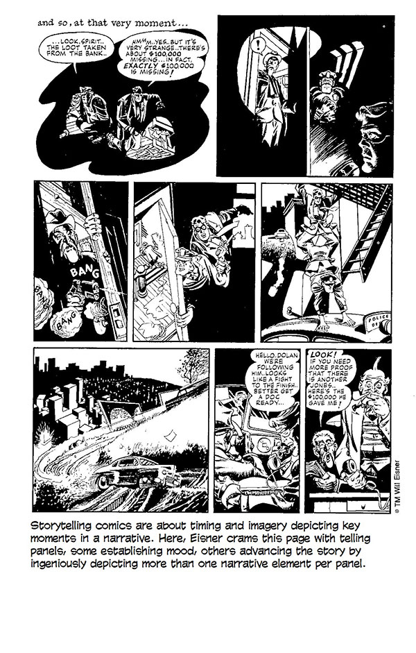
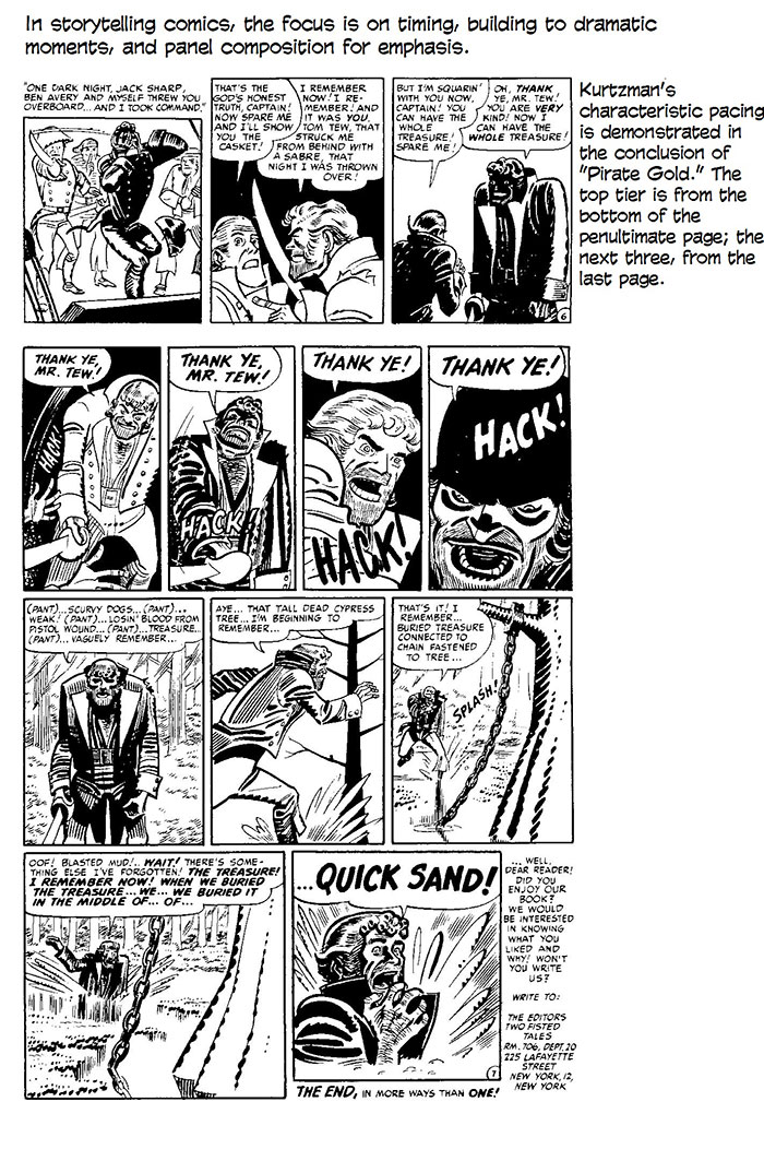
skin-tight reached its apotheosis. Artists like Kirby and Fine helped to establish the importance of figure drawing in the superhero genre of comic book, and many of those who followed in their footsteps were polished artists without being storytellers at all. Others were both storytellers and graphic artists. Such artists as Gil Kane and Curt Swan and Murphy Anderson belong in the figure drawing tradition. The figure drawing school may be said to have reached its apogee in the early 1970s in Neal Adams, whose skill and subtlety in rendering the human form in action was extraordinary. Kirby and Adams set the mold for house styles: those who began drawing for comic books after them were often directed to imitate their styles. Bill Sienkiewicz and John Byrne were, for a time, Adams clones. And to a lesser extent so were George Perez and Jose Luis Garcia Lopez. Sienkiewicz eventually changed his style radically; Byrne didn't, but when he began writing his own stories, he stepped from the figure drawing tradition into the storytelling tradition and stood there, a formidable foot in each camp. The figure drawing tradition would culminate in the poster pages of Image Comics, where, for a time, picture reigned supreme almost to the complete exclusion of story. But Image Comics would not have been possible without the effusions of the more individualistic storytelling tradition. I put Will Eisner and Kurtzman at the headwaters of the storytelling tradition. Their preoccupation was less with drawing and more with story, with content. Their drawings were composed to serve the narrative, to time its events for dramatic effect; similarly, panel composition aimed at intensifying the impact of aspects of the story.
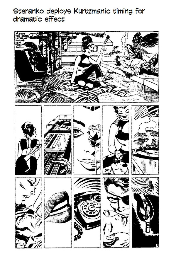
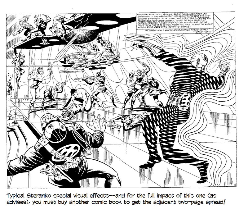
And their work was also highly individualistic; it was therefore unsuited to anything so homogenized as a "house style." Those who were inspired by the work of Eisner and Kurtzman or who worked in the storytelling tradition produced comparatively idiosyncratic works, which, in turn, stimulated others of similar persuasion. We can see the process at work in tracing Kurtzman's effect on underground cartoonists and on European cartoonists. But the storytelling tradition found champions in the American mainstream, too. At Marvel in the late sixties, Jim Steranko was renovating the rhetoric of comic books with a flashy array of special visual effects. Many of these were gimmicky devices— color holds and hallucinatory optical effects— but Steranko's splash pages often showed Eisner's influence, and in some of his sequences we find the kind of pacing for dramatic effect that distinguished the work of both Eisner and Kurtzman.
Special visual effects intrigued several of Steranko's cohorts. Neal
Adams did elaborately symbolic page layouts sometimes— once shaping his
panels in the profiles of his characters, once drawing a wavy grid of panel
borders the seeming undulation of which reflected his hero's momentary
disorientation, another time superimposing the grid upon a full-page rendering
of a face so that each panel focussed our attention on a separate expressive
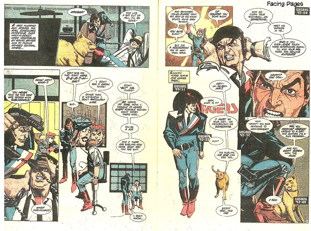
feature of the visage. Walt Simonson in the early 1970s used typography in decoratively dramatic ways in his Manhunter series for DC; and he regularly discarded the conventional grid layout of pages in order to arrange panels of different size and shape in ways that would give dramatic emphasis to the events of his stories. Comic book pages began to have the quality of graphic designs. Of this development, Howard Chaykin is a particularly avid proponent. Chaykin
left comic books for a few years in the late seventies to do "visual
novels" for Byron Preiss. For Empire (1978) and The Stars My
Destination (1979), he produced fully painted illustrations— several to a
page in the fashion of comic book panels— that shared the narrative with the
original author's accompanying text. When he returned to comic books in 1983
with his American Flagg! series for First Comics, Chaykin brought with
him a heightened sense of design, and the pages of Flagg! are laid out
like posters, panels alternating with full-figure renderings or lobby-card
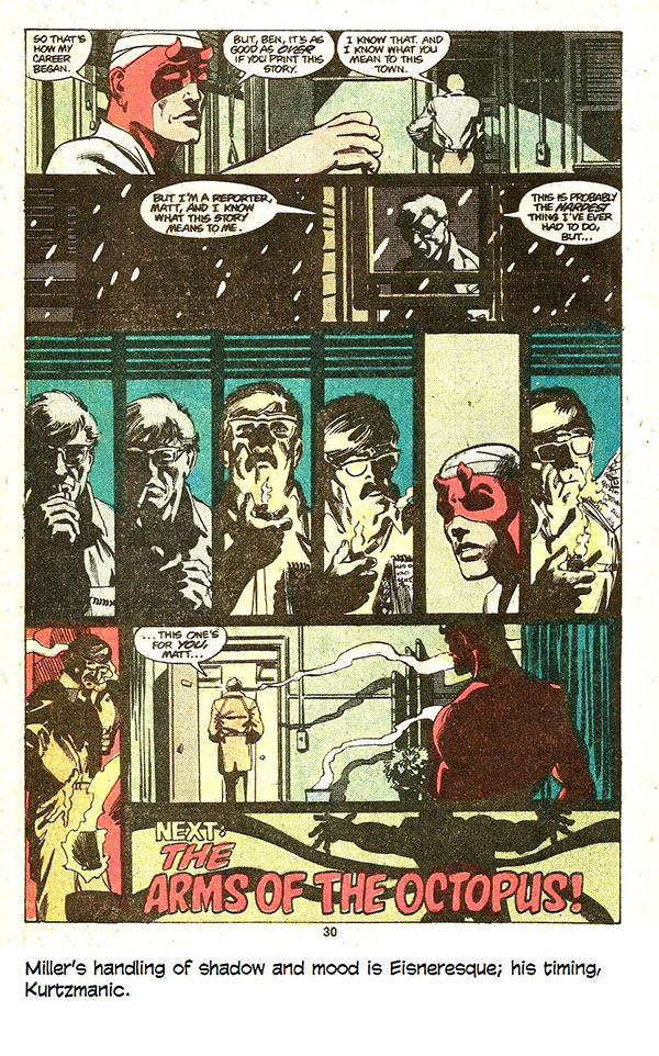
close-ups against a plain white ground. The pronounced design quality of Chaykin’s pages gives sheer imagery a narrative role; there is little continuity of action in the usual manner of comics. The reader absorbs the story as a series of visual impressions, and Chaykin heightened the sense that the narrative progressed by imagistic fits and starts with a storyline that is extremely elliptical, jumping from one incident to the next and landing his readers, often, in the midst of the action with little or no preamble. And he employed the cinematic maneuver of the voice-over: in the last panel of a sequence, the speech balloons of the next sequence frequently appear, making the bridge between scenes. When more elaborate connective tissue was needed, he used television as his narrator: TV commentators supply explanatory background with their reports and analyses of the "news." In subject, Chaykin's story is gritty and vulgar: it plunges through street gang violence in a futuristic multiplex with Reuben Flagg's sexual dalliances as a leitmotif. In treatment, American Flagg! is sophisticated and intellectually intriguing, often in the manner of puzzle-solving. Emotionally, however, the tales are seldom engaging; none of Chaykin's characters are sympathetic enough to make us like them. Still, Chaykin's comics are for adults: they are mature in theme and in manner of presentation. Elsewhere, at Marvel a young artist named Frank Miller was mastering the rhetoric of the medium and deploying it more and more expertly in each successive issue of Daredevil. Miller devoured Eisner and Kurtzman and everyone else who came under his questing eye. He put the lessons he learned to work as he learned them. He seemed to move immediately, almost instantaneously, from mimicry to mastery: he understood a technique he observed so thoroughly that he seemed wholly in command of it the first time he employed it. And every device he used, he improved upon. And Miller had an impact. Other comic book artists watched him. And, even more importantly for the evolution of the medium in the commercial arena, his work stimulated sales. Daredevil was one of Marvel's slow movers when Miller was assigned to it in the spring of 1979; within months, Miller had made it a best seller. And in the process, he had conducted a virtuoso demonstration of an astonishing variety of storytelling maneuvers.
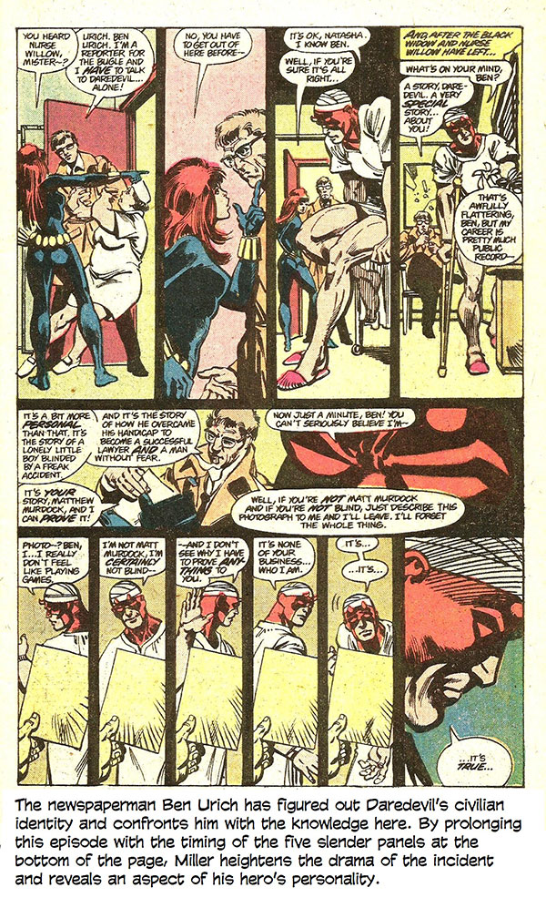
His aptitude for storytelling by yoking the visual to the verbal was so fecund that he soon left his writer behind; after only ten issues, he was writing his own stories. He wrote Daredevil into the same shadowy, grimy underworld of petty criminals that Eisner's Spirit had dwelt in; and he manipulated mood and time with an adroit skill that evokes both Eisner and Kurtzman. Miller's success with Daredevil was emblematic of the last step in the evolution of individualized expression in mainstream comics: with the emergence of the artist-writer (the cartoonist), the committee-generated comic book went into decline. John Byrne had also made the transition from artist to artist-writer, but he drew in the conventional house style and so was neither disruptive nor inspirational as a creative personality. Miller, on the other hand, dazzled with technique and seemed to throw off innovations with every page of his work. Miller left Daredevil and Marvel in late 1982 and produced a six-issue series for DC called Ronin (1983-84). Set thirty years in the future, the story brought the traditions of the masterless samurai into science fiction. But more significant than the substance of the story was the manner of its execution. Miller regarded the months he spent on the project as the most liberating of his professional life. He broke all the rules. His breakdowns and page layouts are startling departures. On some pages, all the panels are page-wide horizontals; on others, all page-wide verticals. Sometimes whole pages were devoted to a single drawing; some drawings take two pages, a double-spread. Some pages have four panels; others, a score. He used color and imagery rhetorically. And all these pyrotechnics served the narrative, giving it emphasis and tone. Finally, Miller also broke with the traditional rendering style of superhero comics. He both pencilled and inked Ronin, using a simple often delicate line. The pictures are textured with hachuring as well as cross-hatching, but his figures are frequently drawn in mere outline. In fact, the visual styling changes subtly from scene to scene to suit the mood of the sequence being rendered. Ronin was a vivid and persuasive demonstration of the medium's new direction in the mainstream: the story was drawn in a graphic style as personal in execution as it was individual in conception. Freed
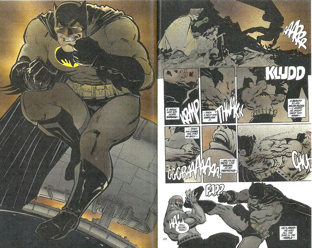
from the time-honored graphic conventions of the medium, Miller took the next
step with the spectacularly different visuals of his 1986 DC offering, The
Return of the Dark Knight. In this four-issue, square-bound paperback
series, Batman comes out of retirement, a rampaging psychotic. The series attracted national attention, proclaiming the literary and artistic legitimacy of the comic book form, which, when in square-back format, began to be termed “graphic novel.” And this success, both commercial and aesthetic, established the validity of eccentric, highly stylized storytelling techniques. Miller's other innovation, telling a story that dwelled on the dark side of Batman's soul, ushered in a new era in superhero comic books: slowly at first then more and more frequently, stories about the traditional superheroes got grimmer, the streets meaner and grittier, and the personalities of the heroes more flawed. Some of these colorfully clad avengers, mostly notably Batman, teetered on the edge of sanity. By the early 1990s, some comics readers were beginning to complain about the "darkening" of heroism: their heroes not only had feet of clay, they had dirty hands, foul mouths, and the ideals of psychopaths. Distasteful though this development was, it also signalled the emergence of a new artistic freedom in the industry. The evolution of the medium was now virtually complete: the graphic novel was on the cusp of establishing literary legitimacy, and both the stories and the manner of storytelling could be extremely individual, even idiosyncratic. Teaming with Bill Sienkiewicz, Miller continued in this vein with Daredevil: Love and War in 1986 and Elektra Assassin later in the same year. Sienkiewicz abandoned conventional linear comic book illustrative methods altogether for both books: the panels were painted in full color, shapes and figures defined and modeled by hues and tones rather than by line. His treatment of the human face and form was stylized, wrenched into abstract caricatures of the personalities of the characters. And raw imagery played a narrative role in both stories. Printed in full color on glossy paper and square bound, both books reflected a growing European influence. Starting in the mid-1980s, the higher production values of European albums were more and more to be found on the American side of the Atlantic. And as the decade drew to a close, another European practice was becoming almost commonplace: increasingly, publishers re-issued a best-selling series of comic books in a single bound volume, an "album," often between hard covers and printed on higher quality stock than the original printing. The European influence was manifest even more directly in the eighties: British writers began producing stories for American publishers. While Miller was doing Dark Knight, Alan Moore was writing Watchmen for fellow Briton Dave Gibbons to draw. A twelve-issue series that started in September 1986, Watchmen was built on the conceit that if superheroes and costumed crime-fighters were real, they would probably be outlawed as vigilantes. Setting his tale slightly into the future, Moore crafted a multi-layered, densely textured story, as laden with leitmotifs both visual and verbal as a James Joyce novel. The complexity of the storytelling made the series an intriguing read, but Moore's conclusion did not live up to the promise inherent in his premise. Although ostensibly debunking the superheroic mythology (albeit affectionately), Moore was at last driven by its conventions to end his story in a nearly traditional way. But he and Gibbons had demonstrated as never before the capacity of the medium to tell a sophisticated story in ways that could be engineered only in comics. And perhaps even more significantly, this complex work had been published by a newsstand publisher, DC Comics. Watchmen's success (it was subsequently reprinted, several times, as an “album”)— coupled to that of Miller's Dark Knight— opened even wider the door in commercial publishing for expression of a creator's personal vision. Neil Gaiman, another Englishman, soon began writing The Sandman, a haunting series of tales in which a modern version of Morpheus lurks around the edges of people's lives, uttering angst-laden psycho-profundities about the futility and meaninglessness of life. Gaiman worked with different artists but his best effects are achieved verbally, in the poetic images and philosophical metaphors of his prose. As noted, the Watchmen/Dark Knight success had a profound effect on the treatment of the comic book industry's patented icons, the superheroes. While some of them got "darker," they all began to reflect the individual vision of writers and editors rather than the corporate policy. Instead of producing stories the substance of which was controlled by licensing operations, the major publishers frequently permitted imaginative re-interpretations of the superhero ethos solely in the interest of telling good stories. (A laudable tendency that would be undercut and abandoned when, in order enhance comic book sales, comic book publishers began to ape the emerging movie versions of their superheroes.) DC even permitted Superman to be killed in the fall of 1992 in order to reinvigorate the Man of Steel legend, the manner of reincarnation being the chief appeal to the imagination. And Marvel successfully combined both ambitious production values and revisionist mythology in the 1993 series called Marvels: in masterful full-color paintings (watercolor and gouache), Alex Ross rendered Kurt Busiek's inventive retelling of the origins of the Marvel Universe from the point of view of a newsman. By the dawn of the nineties, the various currents of creativity in the storytelling tradition had come together to revitalize the commercial medium. The figure drawing tradition, on the other hand, had evolved into Image Comics, which was founded by artists who wanted ownership of their creations, which, at the time, was not possible with mainstream publishers. "Image" said it all: at first, these comics are all picture and no story. Image Comics benefitted from the pulse of individuality that coursed through the storytelling tributary: without the idiosyncratic styling of Miller and the poster-page design of Chaykin there may not have been any Image Comics. But what might have been the eccentricities of individual styles elsewhere became a house style at Image: many of the founding artists— Rob Liefeld, Eric Larsen, Marc Silvestri— drew the human figure in the same monumental manner with refrigerator torsos, elephantine limbs, and tiny pinheads. Several of the artists even modeled forms with the same fine spray of line fragments. The stylization of anatomy culminated in a rendering of facial expression which consisted almost entirely of a single teeth-bearing grimace of rage. The founding artists of Image Comics defied the traditions of the industry by proclaiming they didn't need writers. And since the artists had little experience in writing stories, the first books they produced reflected their visual bias: they produced pages that were designed as posters rather than as increments in a storytelling process. Some of the titles featured teams of superheroes in the Kirby tradition, but the Kirby influence seemed to end with the concept: the covers and interiors of many Image titles depicted groups of colossally proportioned characters in monotonous heroic poses, but these larger-than-life figures had no life, no personalities. Eventually, the Image founders turned to writers to assist in constructing stories, but the compelling attraction of the company's earliest titles resided in the visual stylings of the artists. The founders were all "hot artists," artists whose graphic quirks in Marvel Comics had attracted enthusiastic and vocal followings. Image Comics was essentially a banner under which the artists collected in loose aggregation to produce comic books featuring their creator-owned characters, thereby catapulting their box office appeal into healthy bank accounts virtually overnight— again, thanks to the network of direct sale shops that fostered the feverish passions of the fanatic collectors who hoarded titles by their favorite artists. The prospect of cashing-in on creator-owned properties attracted other artists and writers to the banner, but the initial success of the enterprise seemed to rest entirely on the popularity of this artist or that, and, given the fickle attention span of the American consumer, the future of Image Comics was, at first, scarcely certain. Over the years, Image Comics secured a place in the market with stories that were solid as well as superbly drawn. Long before that, however, the phenomenon of Image Comics demonstrated a new economic truth about the comic book marketplace: the direct sale shop network could create millionaires. If the artistic energy of the figure drawing tributary seemed diverted into the eccentric eddy of Image Comics, at first a mere backwater of creativity, the storytelling tributaries converged into a confluence of growing narrative power, bending all of the medium's devices to the task of telling a story. In exploring the potential of the medium, the storytelling cartoonists seemed on much firmer footing than the figure drawing artists as the century wound to a close.
Feetnoot. The foregoing essay is ripped, almost entirely, from a chapter in my book, The Art of the Comic Book, which, you might know, is for sale hereabouts. Just go back to the first page and scroll down to the pictures of book covers.
|
|||||||